New England’s Original IPA Gets a ‘Wicked’ New Look
One of the first craft brewers in New England, Harpoon Brewery aims to spear new business while distinguishing itself in the crowded craft category with a new package design that leverages iconic assets.
The distinctive Harpoon diamond takes the central location on pack, dynamically framing the brewery illustrations and also serving as a robust wayfinding device at shelf.
Since the original launch of Harpoon IPA in 1993, the craft beer aisle has grown exponentially. At its onset, Harpoon IPA – New England’s original IPA – was one of only a handful of craft beers brewed on the East Coast, and it quickly became a bestseller known for its “easy-drinking” flavor profile.
Harpoon IPA BEFORE the redesignHarpoon IPA BEFORE the redesignThroughout the years, the craft beer category ballooned with new offerings and specifically new IPAs. As a result, it became harder for Harpoon to distinguish itself and grab the attention of new consumers. Consequently, Harpoon Brewery decided it was time for a redesign that would help it stand out in the category and tell its unique story. The company turned to creative agency Chase Design Group to help communicate the brand’s personality and express its values with breakthrough design.
The Chase design team began by digging into what separates Harpoon from the competition. Its employee-owned breweries, located in Boston, Mass., and Windsor, Vt., focus on community involvement and a passion for charity. This proud heritage of Harpoon as the original IPA of New England needed to be expressed through its packaging. Chase carefully evolved key brand equities, including the vibrant blue background, orange accents, and the Harpoon logo while adding new illustrative elements to the pack.
See it Live at PACK EXPO Connects Nov. 9-13: Filling Technology for the Wine + Spirits Industry, by Fogg Filler Company. Preview the Showroom Here.
“Harpoon IPA had built up a unique set of iconic assets, but this set of tools failed to fully relay their incredibly unique brand narrative in the crowded craft cooler. As one of the very first craft beers in New England, it felt only right to celebrate both the original South Boston and the Windsor, Vermont, breweries on pack. The distinctive Harpoon diamond takes the central location on pack, dynamically framing the brewery illustrations and also serving as a robust wayfinding device at shelf,” says Chase Design Group Executive Creative Director Steve Dunphy.
Read related articles on beer packaging design from Packaging World:
After adjusting the label hierarchy, the Chase team then focused on the details of the design. The messages, “Employee Owned” and “New England’s Original IPA,” flanking the iconic letter “H” diamond, a subtle harpoon silhouette within the “P” of the Harpoon logo, and new lettering for the IPA were all added to make the bold design feel nuanced and crafted.
“The Chase Design Group team found just the right balance to strengthen the connection with our current drinkers and attract new ones to the brand, while allowing us to extend for future portfolio options,” says Jon London, Chief Marketing Officer, Harpoon Brewery.
Read about the state of the craft beer industry in Packaging World’s Craft Brew Packaging & Processing Innovation Supplement. Included are articles on new filling lines at Alstadt Brewery and Allagash Brewing Co., the addition of a vertical disk centrifuge at Rhinegeist Brewery, and new equipment at Revolution Brewing to accommodate aluminum cans.
PACK EXPO Connects
Join us for “The Most Engaging Virtual Event for the Entire Industry” at PACK EXPO Connects, November 9-13. Live demos of equipment and products, live chat with product experts, expedited product search, and more. Attendee registration opens September 15. Be notified when the site goes live by clicking here.
Fresh from the show floor: pharma packaging innovations for 2026
Serialization mandates. Containment demands. Sterile barrier requirements. Our editors found the pharma packaging innovations addressing your biggest challenges at PACK EXPO Las Vegas. Get your free curated report now.
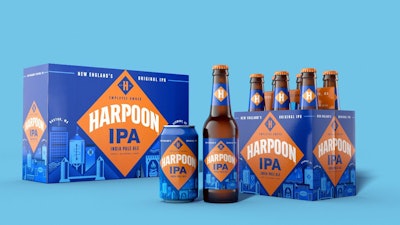
 Harpoon IPA BEFORE the redesign


![“Another key [UDI] benefit, because we're calling that product by the same name across the healthcare supply chain… rich and robust data that we can access around supply consumption and utilization rates. One of the buzz terms we've heard during the COVID-19 crisis was what's my burn rate? How fast am I going through gowns, masks, gloves?” – Mike Schiller, Senior Director at AHRMM](https://img.healthcarepackaging.com/files/base/pmmi/all/image/2020/08/UDI.5f4d326e41d53.png?auto=format%2Ccompress&fit=crop&h=167&q=70&w=250)