Quick hits:
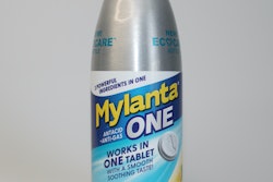
- Mylanta® One Antacid + Anti-gas EcoCareTM Tablets feature their new EcoCare bottle. While the bottle looks like something we’re used to seeing hold liquid products, McNeil opted to house tablets in a recyclable aluminum bottle.
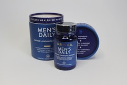
- Matte bottles and tubes with foil or aluminum accents were prominent, including FR!SKA Men’s Daily Emzyme and Probiotic Support, Maty’s® Coco Mint Cough Syrup, and Rohto Cooling Eye Drops in Optic Glow.
- Maty’s® Organic Coco Mint Cough Syrup delivers a natural vibe with a tan, matte shrink sleeve—that remains on the HDPE bottle after peeling the tamper-evidence portion—and leaf and chocolate images.
 | Read the transcript below: |
Hi, I’m Keren Sookne with Take 5 video for Healthcare Packaging. Today we’re talking highlights from our Annual Package Design Gallery, which just posted in two parts.
Now if you’re not familiar with the gallery, each year, we evaluate an array of over-the-counter product packaging designs, assessing pros and cons from a user perspective.
These are in no particular order, let’s get started!
First, we have Mylanta One Tablets in their new EcoCare bottle. While the bottle looks like something we’re used to seeing hold liquid products, McNeil opted to house tablets in a recyclable aluminum bottle.
The package is sleek, lightweight, easy to reclose and stands out on the shelf where clear or frosted plastic bottles tend to dominate.
I will say… the user may need to take a close look at the label to understand this is not a liquid format—particularly with the opaque bottle. Now, the cap and label feature copy and imagery to indicate tablets, but user perceptions can be very strong at first glance.
That being said, consumers ARE clamoring for recyclable options, and this offers a packaging material that they’re used to recycling at home.
Next, Health By Habit’s supplements feature a matte, lightweight HDPE container with bright single-color label to differentiate between products in the family for energy, sleep, vitamin C, and more.
The sturdy two-tone cap is removable by unscrewing the traditional way and offers a wide mouth for easy access to capsules.
Now without cues, some consumers may miss a unique feature: the cap overlay twists to reveal an opening (where the yellow oval is in the image). While this offers fast access, several capsules did come out at once when I used the cap opening at first.
With minimal graphics, the front of the label notes active ingredients in clear black type. White writing on the yellow could be hard to read for some, but other packages in the line offer more contrast. And the black font on the back is clear, along with suggested serving size and social handles.
Moving on, Maty’s® Organic Coco Mint Cough Syrup delivers a natural vibe with a tan, matte shrink sleeve—that remains on the HDPE bottle after peeling the tamper-evidence portion—and leaf and chocolate images .
The label here is really making use of every panel with copy—ingredient images, an Instagram handle, a warning about not giving honey to infants, a callout about donations to Vitamin Angels, and a made in America note.
Something that stood out was that it explains the need for headspace to shake the syrup. With customers questioning excess packaging, this was a smart move.
Now, with honey dangerous to children under the age of 1, I do wonder if the honey warning could have been bigger or placed inside of a text box. But, honey is listed as the first ingredient in one panel and the front clearly says “For ages 1+”
Presumably, the consumer needs to remove the sleeve before recycling in the #2 stream.
Now, we’re checking out FR!SKA Men’s Daily Enzyme + Probiotic Support Capsules.
The secondary package is an attractive, clean matte paperboard tube. Everything’s very cohesive in a bright navy blue. The bottle inside offers this really high-end look in clear blue glass.
The labeling on the bottle and tube feature metallic foil brand name and accents, and the insert fits the bottle well, which keeps everything secure in transit—very important for glass.
The symbols on the back and top of the tube provide easy-to-read product features and the clear sticker for tamper-evidence allows copy to show through.
Note that the tube is large, which offers a lot of real estate for supplement facts and white space to make this an easy-to-read label, but some consumers may be concerned about excess packaging with a larger tube housing a smaller bottle.
Again making use of foil accents, The Mentholatum Company’s Rohto Cooling Eye Drops in Optic Glow convey “cooling” with eye-catching foil elements in iridescent silver, blue, and purple—they’re these nice opalescent colors in a soft palette. The carton has a clear image of the bottle image showing what’s inside.
The top panel offers a QR code to “Scan for Reviews,” enticing the consumer to check reviews in-store. The link takes you to a general reviews page for various eyedrops in the product family, and not Optic Glow drops specifically.
Like the Friska packaging, everything is very cohesive. Inside, the child-resistant bottle features an iridescent label and is wrapped in a clear inner pouch. Directions on that inner pouch are in white ink on a clear pouch, so not all users will be able to see that clearly, but the bottle label itself features clearer directions with more contrast.
There are a lot more packages in the design gallery, so check out Parts 1 and 2 of the story at the links below.
That’s all for today but stay tuned for ongoing package design coverage. See you next time at Take 5 for Healthcare Packaging!


![the{PACK]out: Day 3 featured hands-on workshops to bring package design concepts to life. (Image courtesy: Cassie Ladd)](https://img.healthcarepackaging.com/files/base/pmmi/all/image/2022/06/Day_3_workshop_KS.62b0d20c14538.png?auto=format%2Ccompress&fit=crop&h=167&q=70&w=250)
