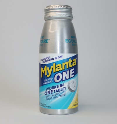
McNeil Consumer Pharmaceuticals Co. Mylanta® One Antacid + Anti-gas EcoCareTM Tablets
McNeil Consumer Pharmaceuticals Co. Mylanta® One Antacid + Anti-gas EcoCareTM Tablets
Pros
- Sleek, opaque silver EcoCare bottle stands out on shelf
- Label notes EcoCare is composed of “infinitely recyclable aluminum”
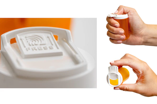
- Packaging with recloseable cap can theoretically be repurposed by consumer if desired
- For tamper evidence, label notes not to use if cap is broken from ring
Notes
- With years of consumer perception that “aluminum containers tend to mean liquid,” the user may need to take a close look at the label to understand this is not a liquid format—particularly with the opaque bottle—though the cap and label feature tablet copy and imagery prominently
Health By Habit Energy Supplement  Health By Habit Energy Supplement
Pros
- Matte white and yellow, the lightweight HDPE container features a unique, sturdy two-tone cap that twists to reveal an opening for capsules
- With minimal graphics, the front of the label notes active ingredients in clear black type, with quippy copy
- Black font on the back is clear, along with suggested serving size and social handles
Notes
- Cap is removable by unscrewing the traditional way and offers a wide mouth for easy access to capsules
- Without cues, some consumers may miss that the cap overlay twists to reveal an opening (where the yellow oval is in the image); while fast, several capsules came out at once when using the cap opening
- The clean, minimalist aesthetic is nice, though it could be difficult for some users to read the white font on yellow background for the Energy blend in particular (other styles features different colors with more contrast and are easier to see)
Crayola™ Crayon Shaped Antibacterial Bandages
 Crayola™ Crayon Shaped Antibacterial Bandages
Pros
- The lightweight paperboard carton looks like the charming and familiar crayon carton kids know
- Front and side panels show bandage designs; primary packaging clearly notes “not made with natural rubber latex”
- Instructions are clean, albeit small, allowing the crayon carton graphics on both sides
Notes
- Presumably the carton is recyclable in paper streams, but there is no disposal symbol on the carton
Maty’s® Organic Coco Mint Cough Syrup Maty’s® Organic Coco Mint Cough Syrup
Pros
- Bottle gives a natural vibe with a tan, matte shrink sleeve (that remains on the bottle after peeling the tamper-evidence portion) and leaf and chocolate images on the HDPE bottle
- Silver cap features instructions to “Shake Well Honey”
- Label makes use of every panel with copy—ingredient images, Instagram handle, a warning about not giving honey to infants, made in America, and a callout that a portion of sales are donated to Vitamin Angels—and explains the need for headspace to shake the syrup
Notes
- Could the honey warning be bigger or placed in a text box? Perhaps, but honey is listed as the first ingredient in one panel and the front says “For ages 1+”
- Presumably the consumer needs to remove the sleeve before recycling in the #2 stream
Nature’s Bounty® Gold Series Multi Jelly Beans Nature’s Bounty® Gold Series Multi Jelly Beans
Pros
- While many have moved to shorter and more square-shaped bottles, the PETE bottle is tall with a wide-mouth, easy-open, child-resistant cap
- Gold on the shrink sleeve and cap is striking, while the clear bottom of the shrink wrap lets consumers see the jelly beans inside
- Label features strawberry and lemon graphics without looking cluttered
Notes/Cons
- Directions are easy to understand but a bit hard to see in small white type on teal; the sleeve was a bit curved on the back, which caused copy to distort ever so slightly, but it remained legible
- The taller bottle stands out, but consumers may wonder about the need for approximately 2 inches of headspace
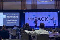
![At the[PACK]out, presenting 'Wicked Stability: Predicting the Aging Degradation of Materials' were speakers (from left): Dan Burgess, Henk Blom, and Rod Patch w/ Moderator Seema Momin.](https://img.healthcarepackaging.com/files/base/pmmi/all/image/2022/05/Wicked_Stability.627af09af0762.png?auto=format%2Ccompress&fit=crop&h=167&q=70&w=250)