Quick hits:
- While recycling isn’t necessarily the “be all end all” answer to sustainability woes, consumers are looking for products with recycling cues to keep materials out of landfills.
- The How2Recycle symbol scores points for easy instructions and recognition.
- Where space allows, some companies are offering sentences with a more conversational approach with their customers.
- Consumers are increasingly avoiding the traditional single-use plastic bottles that they’ve traditionally purchased off of retail shelves.
- E-comm or D2C brands are popping up with a different value proposition, often in the form of a durable packaging starter kit that might be large and heavy, but it’s a one-time purchase.
- Each cycle of re-use improves the overall sustainability profile of the package system in comparison to single-use formats.
Related to this episode:
- Annual OTC Package Design Gallery: Part 1, Part 2, Part 3
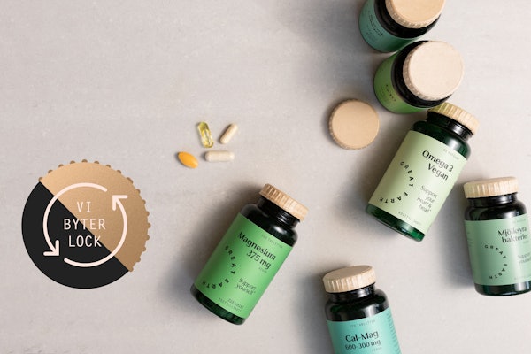
- Subscription D2C Supplement Brand Makes Sustainable Impression at Unboxing
- The Consumer Behavior of Plastics and Recycling in America
- Study: Flexible Healthcare Packaging Materials Can Be Recycled
- It's essential to provide resources to the next generation of rising leaders in the packaging and automation industry. PMMI's Emerging Leadership Network provides networking events, awards programs, and professional development opportunities. Find out more by visiting their website.
 | Read the transcript below: |
Keren Sookne: I’m Keren Sookne with Take Five Video for Healthcare Packaging. Today we’re looking at a few ways that an over the counter or personal care package asks to be recycled.
Now we know that recycling isn’t necessarily the be all end all answer to sustainability with the infrastructure that exists today. But more and more consumers are looking for those recycling cues in hopes of diverting waste from landfills.
Let’s get into the packages! These are all from our Annual Package Design Gallery.
First we have our familiar friend, the How2Recycle symbol on ZzzQuil Pure Zzzs sleep remedy. I like these from a personal standpoint because they’re easy to recognize and there’s no guesswork on the various components. Now a note about that. In Kim Overstreet’s story, The Consumer Behavior of Plastics and Recycling in America, she notes some consumers feel frustrated when they see that a component of the package isn’t recyclable. But at the same time, 86% of those surveyed find the label helpful and they think it makes it easier to know which parts of the package are actually recyclable.
Next, Quip toothpaste. They opted for a pretty descriptive text box that lets the consumer know exactly: Once it’s empty, replace the cap and recycle in the #2 stream. They also feature this text on the tube itself. An example of how we’re seeing sentences and instructions more, beyond symbols. On the bottom of the carton, there’s a note that it’s 100% paper and to please recycle.
Next we have Garden of Life Kid's Stress Relief Gummies, and we can see that recycle symbol and copy noting that the bottle itself, which is PETE, is recyclable and you can see the 1 symbol on the bottom.
On Every Man Jack pocket-sized hand sanitizer, we have a nice little recycling symbol in a row with other symbols and it’s clearly marked that it’s the #2 stream.
Finally, we have the care/of line of supplements. They opted for a please recycle me on the bottom of the carton. The bottle has a #7 on the bottom—it does blend in a bit with that matte sage color but the lettering is raised quite bit.
This was by no means an exhaustive list, of course, but that’s all the time we have today.
Matt Reynolds: Hello. I'm Matt Reynolds, editor of Packaging World Magazine back with another edition of Take Five.
I recently spoke to the folks at Saraphina Therapeutics. They're coming out with a nutraceutical product called Fatty15, which is a proprietary fatty acid that they've discovered in dolphins of all things. And they believe that it's going to improve longevity in humans, which is they feel a major step forward. Sign me up for longevity, but to coincide with kind of that big splash that they think they're making with this product, they wanted a starter kit that would grab attention as well.
And they did so with again, that starter kit format with a durable package within, and then refill packs, which in this case, because it's a nutraceutical, are going to be coming in metalized, foil pouches, but light metalized, foil pouches that can be mailed in a 30 day interval. So every month thereafter you'll get a refill. The durable portion of the Fatty15 format is actually in the form of a glass jar. The glass jar is tinted light blue or green, kind of a seafoam color includes a sustainable bamboo closure that's actually quite pleasing to the eye. And it's also screen-printed as opposed to using pressure sensitive labels or any kind of a shrink wrap or anything like that, shrink sleeve, I mean. And the reason is it's intended to be displayed on a shelf in the bathroom as opposed to hidden away, behind your mirror.
And it's supposed to last for cycle upon cycle upon cycle. Extending outside of the durable element is the starter kit itself, which is entirely recyclable, save for the metalized pouch. One interesting thing is they chose to use a slip screen, a slip sheet, excuse me. It's hard to say. A slip sheet as opposed to printing directly on the interior corrugated on the shipper and what this does is it prevents the dust that can happen, that can be created in shipping anything that's corrugated. It prevents that dust from settling on that beautiful glass container.
Thanks for watching this week's Take Five from Healthcare Packaging.


