This year’s gallery featured many calming and minimalist aesthetics, signifying a consumer looking for relief at home and work—outside of the clinical setting.
Trends on the shelves
- While perhaps not pandemic-related (with formulation, package design and commercialization often taking years), there was a notable increase in stress-fighting, anti-anxiety, and calming products, even for children.
- Blues, greens, and serene imagery were featured more prominently than last year.
- The minimalist trend continued with whitespace on labels and cartons, and casual, quippy copy directed at consumer.
- Larger mainstream brands used nature-inspired images and touted few ingredients or “what’s absent” from the product.
- More recyclable packaging and instructions featured.
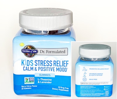
Garden of Life Kids Stress Relief
Pros
- A shrink sleeve makes the most of the real estate, offering founder’s story, icons for expected effects, and symbols for gluten-free, recyclability, renewable energy use, and more
- Calming sea and cloud images; suggested use lets parents know daily dosage
- Square jar stands out on shelf; wide mouth child-resistant (CR) lid was easy to open
Notes
- The sleeve was a bit curved on the bottom of two panels, which caused copy to distort slightly but it remained legible
- Customers would presumably need to remove the sleeve before recycling
Olly Goodbye Stress Gummies

Pros
- Bright standup recloseable pouch features serene blue and turquoise hues
- Servings per package are clear; touts “Jet Set Friendly” size
- Matte pouch with spot gloss/foil on front and back gives high-end look; notches for easy opening
- Usage, warnings, and symbols on back are spaced well
Notes
- Disposal instructions not specified
La Mend Inc. The Good Patch

Pros
- Matte baby blue recloseable pouch with dreamy icons and whitespace (which is easier when Drug Facts are not required)
- Back panel is well-organized with lines separating ingredients, directions, warnings, a link to a “surprise,” and more
Notes
- Disposal instructions not specified
Noho Health Inc. care/of Immunity

- Matte outer carton in soothing green; matches matte rectangular easy grip bottle
- This is part of a colorful care/of product family for various needs; enclosed leaflet showcases product combinations
- Glossy lettering and imagery are printed on bottle; instructions are small but contrast well against simple background
- Minimal abstract graphics allow for conversational, explanatory copy without a “busy” feel
Notes
- Carton says “please recycle me” on bottom, but consumers may not know how to recycle the bottle (#7) depending on local infrastructure
- More aesthetically minded consumers may notice that the white lid stands out against the coordinated pastel bottle and carton
Wyld Cannabis Infused Peach Gummies

- Eye-catching hexagonal carton with triangular top; THC symbol and potency are prominent
- Batch-specific info is printed directly on carton and on jar; bright orange inner carton with warning copy; jar label also features botanical imagery
- Opaque polypropylene CR pop-top jar features tamper-evident sticker and opening instructions on lid; jar opened smoothly and features serving info
Notes
- It may be difficult to see the tiny recycling symbol on bottom of jar
- Edible-specific instructions are useful and stand out in silver, but could potentially be missed on bottom of carton
- The carton shape is certainly eye-catching, but it's good to note that anything that isn't flat on top becomes harder to stack in shipping cases.
Check out Parts 2 and 3
Part 2: Cold and sleep medicine, and infant care
Part 3: Topicals, skin care, and personal care