Color long has been king in the visual hierarchy of packaging, but there are signs that shape might be poised to step into a more prominent role. Anecdotally, defining package shapes seem to be occurring more frequently for new-product introductions—an observation shared by several brand owners and design consultancies. The trend could accelerate in 2009 and beyond if the economy begins to rebound and consumer packaged goods (CPG) companies become more comfortable about allocating precious marketing dollars for structural design.
The long-accepted visual hierarchy in package design has been color first, followed by shape, graphics, and text. But some branding experts believe that shape might be in the early stages of moving into a “1-A” status with color as the continued proliferation of products and shelf-keeping units (SKUs) has created an exhaustive rainbow of packaging color down every aisle of the store.
To some degree, custom shapes long have been a part of packaging. The venerable Coca-Cola bottle arguably is the most recognized package shape on the planet. Spirits brands are masters at crafting shapely bottles, and marketers of non-alcoholic beverages have begun to hop on the bandwagon. But a telling observation that shape might be ready to make a bigger splash is that products in other areas of the store—where structural innovation is rare—also are beginning to get in on the act.
Examples cross aisles
Here are three recent examples of how a defining shape is producing high-impact packages in different product categories:
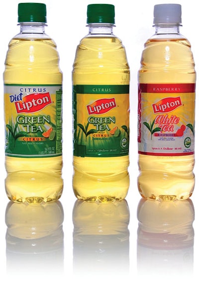
• A proprietary 500-mL bottle design for three flavored, noncarbonated Pepsi brands features an inventive shape that translates Pepsi’s message across each product into a form that also meets the technical requirements of a lightweight bottle.
Lipton Iced Tea, Tropicana juice drinks, Aquafina FlavorSplash, and Aquafina Alive share the new PET bottle design. The large production volume of these products requires only one bottle design for all three brands—an alternative solution to the quest for shape that some CPG companies are taking to control package costs over multiple brands. A common bottle design also is possible because the three brands share similar attributes, such as “refreshing,” “natural,” and “energy.”
Horizontal, wavelike lines are formed in the entire bottle mold, giving it a distinguishing profile that PepsiCo needs to project those brand attributes. Stuart Leslie, president of 4sight Inc. (www.4sightinc.com), which created the design, says the wavy lines simulate a slow-moving “stream.” Curves are spaced randomly to convey nature and an organic quality in the bottle form. Fingers fall easily into the troughs, making the bottle comfortable to grip. When viewing the bottle, it looks different from any side.
Bottle suppliers are Amcor (www.amcor.com), Plastipak Packaging (www.plastipak.com), Ball (www.ball.com), and Constar International (www.constar.net).
Benefits of the new bottle’s wavy design go beyond aesthetics; PepsiCo also had a goal of reducing plastic usage. The bottle’s design pattern makes thinner walls possible, thereby reducing plastic usage by 20%. In addition to satisfying consumer and environmental needs, the bottle also conforms to PepsiCo’s manufacturing process.
“4sight’s understanding of the Pepsi culture and our bottling partners enabled them to bring our design objectives across several brands,” says Denise Lefebvre, director of packaging R&D at Pepsi. “Now we have the winning combination—a lightweight bottle that communicates the message of our noncarbonated brands through a unique design that also results in competitive advantage on the shelf.”
• In the household products aisle, Procter & Gamble stages the brand expression for its Cascade Complete automatic dishwasher detergent by calling on shape to communicate the brand’s chief emotional purchase driver—confidence that dishes will get clean on the first attempt.
As with color, it’s important to understand which values that shape communicates to your brand’s target consumer before beginning design work, says P&G’s Ryan Dullea, assistant brand manager for Cascade. This shared understanding of the impact of design between brand managers and designers is producing some eye-catching packaging at P&G. Shape works with color to convey a value message for the reformulated Cascade Complete All in 1 ActionPacs automatic dishwasher detergent.
Working with design agency LPK (www.lpk.com), P&G identified shape as the means for transforming an everyday dishwasher detergent into a lifestyle brand with panache.
“Women who purchase Cascade already buy premium products in other categories,” says Keara Schwartz, P&G design manager, citing the company’s consumer research in beauty care products. “She values performance and experiences, and that translates across categories.”
Shape = power
Shape’s influence on the Cascade brand is evident with both the product and the package. The detergent gel is filled in a vortex shape inside the ActionPacs dissolvable packs. The gel bears the brand’s signature green and blue colors. This swirl sparkles on the container’s clear, pressure-sensitive label. The packs come inside a clear polypropylene container (P&G would not identify its suppliers) resembling a jewelry box to be displayed on countertops. The container’s narrow base extends outward to a wider shoulder—a departure from the category’s linear paperboard cartons and opaque-bottle forms. Together, the ActionPac and container shapes softly communicate power and instill confidence in Cascade’s cleaning capability for consumers who demand dependable product performance. “Shape is a key differentiator, and it’s a really important tool to leverage for Cascade Complete as a commodity product,” says Keara Schwartz, a P&G design manager.
• The geometrical, Y-shape of a clever bottle for Los Angeles-based Y Water Inc. is designed to appeal to elementary school children. Natural rubber connectors, called “Y Knots,” enable kids to connect empty packages as molecule-like formations and prolong the life of the bottles by transforming them into toys or building blocks.
“When looking for a low-calorie, organic drink for our own kids, my wife and I came up empty-handed,” says Thomas Arndt, president of Y Water. “Obesity is a major problem among kids, and we wanted to create a beverage that can positively influence them about the importance of staying healthy.”
Arndt accomplishes that with the help of fuseproject (www.fuseproject.com), an industrial design and branding firm. The playfully shaped, 9-oz bottle reflects the brand’s core message of fun and portion control by drinking a healthful beverage available in four kid-centric flavors: Bone Water, Brain Water, Immune Water, and Muscle Water.
“Packaging is the hero of the Y Water brand,” Arndt says. “The Y bottle truly helps to differentiate our products by engaging consumers in a way that is completely unexpected.”
Y Water selected Eastar® copolyester from Eastman Chemical Co. (www.eastman.com) to create the bottle. The material’s blow-molding characteristics make the upside-down, three-dimensional Y shape possible and provide enough wall thickness to withstand Y Water’s 185˚ F hot-fill process. Yet, it also offers sufficient durability to withstand rough handling and reuse by children.
These marketing pluses add up to a package with strong shelf presence, reusability, and functionality—three benefits that resonate with consumers today.
The start of a trend?
The packages for PepsiCo, P&G, and Y Water respond to the need for differentiation in the store. They are representative of the movement toward eye-popping and functional geometrical shapes, embossed and debossed patterns, and sustainability—mindful designs that could further elevate packaging’s stature in a marketing program.
By understanding the emotional, functional, and economic drivers behind the use of shape, marketers can sharpen another one of the tools at their disposal to maximize shelf impact and also link packaging to new usage occasions, thereby driving additional sales.
Benchmarking studies by Perception Research Services (www.prsresearch.com) support this point. These studies have routinely found a strong correlation between well-executed packaging and shoppers’ brand perceptions and purchase intent. The company conducts dozens of in-store marketing studies each year and says that about 25% of packaging systems it has evaluated actually strengthen brand perceptions and product preference.
“We are big advocates of structural innovation,” says Scott Young, company president. “We consistently see that it can dramatically impact shelf visibility and brand imagery, as well as enhancing functionality and driving increased usage.”
Color has carried the “salesman” load for years, and it remains an integral part of any well-designed package. Color evokes emotion from and creates meaning for consumers, thereby creating value.
Like color, shape communicates instinctively. It creates not only recognizable branding but also projects upscale, sophisticated cues. In great packages, a defining shape works holistically to support brand positioning.
4sight’s Stuart Leslie, who specializes in structural package design, says color and text are crucial to brand success, but brand marketers fall short of fully exploiting the power of design when they pair distinctive colors and custom text with a stock package shape. A truly effective package, he says, also includes a complementary shape.
“You can communicate so much about a brand with structural design. This is the language of credibility to consumer,” Leslie explains. “Bright color will draw the eye from a distance, but shape and form tell the story of the brand.
“If you put that same message as words on the label or in an advertisement, consumers don’t believe it. But when you build it into a bottle through structural form, it speaks to the consumer at a whole different level. The message becomes believable to them.”
4sight’s studies for Unilever, Pepsi, and Wm. Wrigley Jr. Co. have validated that consumers associate structural package form with meaning and brand credibility, Leslie adds.
Ares Marsaligiller, director of LPK, agrees. Effective shapes lure shoppers to a brand’s shelf set with a distinctive but unified appearance—a strategy known as “brand-blocking” in marketing circles. Here, color’s role is to help consumers identify different product varieties within a brand family.
“Consumers look at a store shelf from 10 feet, three feet, and one foot away,” says Marsaligiller, who crafts package-design strategies for Procter & Gamble. “They want to notice new things and understand why they should pay attention to you. Shape provides the shelf impact that will draw you in. It’s a huge differentiator.”
How to get started
Brand marketers who want to take a closer look at elevating the role of shape in their packaging might want to heed the advice of P&G’s Keara Schwartz and Ryan Dullea. They say that success with shape starts with two realizations. First, shape isn’t a brand communicator by itself. It needs to work holistically with color, graphics, and text.
Second, Schwartz and Dullea say, your creative team can’t start with a blank canvas and then decide, “We need a new shape!” Strive first to understand what is important to your consumer through tactics such as conducting word-picture associations that prompt expressions of what is meaningful and desirable about your product. Then assemble your creative team to review those associations and let them inspire the creation of an on-message shape to communicate brand meaning and desire at both the point of purchase and the point of use.
When executed well, as with the wave-pattern bottle for PepsiCo, shape influences consumer perceptions of a quality product, 4sight’s Stuart Leslie says. “Brand owners are beginning to discover this. Bright color will draw the eye, but the form tells the story of the brand,” he adds.
How can the creative team convince senior management to take a calculated risk in tough economic times and invest in the right structural design for their brand? Because you’re dealing with bottom-line executives, 4sight’s Stuart Leslie foremost recommends emphasizing any financial benefits that could result from changing the package structure.
“When I tell someone they’re going to sell more product based on a new form, they don’t believe me,” Leslie says. “So I’ve changed my approach. Now, with any client, we tell them, “We can take the cost out of your packaging with a new form solution, and by the way, you can also sell more product.’ Then they’re more likely to bite.”
Jim Barrett, CEO of Brandimage (www.brand-image.com), an industrial and graphic package-design consultancy, offers a final perspective about designing custom shapes. “What most of our clients would say right up front is, ‘It’s too expensive.’ The main concern among brand managers and marketers always is they don’t want to wreck the brand.
“What I suggest that brand owners do is treat design as the upfront rule to be audacious and to challenge the status quo. It doesn’t have to be a major, crazy change,” he concludes. “It can be a subtle structural change.
“So many bottles are just using standard structural designs and changing only the label. But I think that way of thinking is going to change dramatically.”