Key Takeaways:
· Genexa’s redesign focuses on helping parents quickly identify the right product using bold visuals and clear messaging.
· The packaging uses white space and front-of-pack claims to communicate clean ingredients and benefits, while still accommodating complex OTC regulatory requirements.
· A new color-coded system and scalable design approach improve shelf visibility, product organization, and future portfolio expansion.
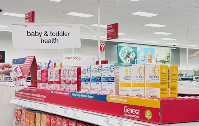
As over-the-counter (OTC) shelves grow increasingly crowded, packaging has become more than a vessel, it’s a critical tool for navigation, trust, and decision making. For clean medicine brand Genexa, its recent packaging redesign reflects a decade of category creation and a shift toward helping parents find what they need faster, especially in high-stress moments. Unlike many consumer-packaged goods, OTC medicines are often purchased under pressure. Genexa’s Chief of Marketing, Carmen Graham, says the brand’s redesign leans into that reality.
"It never happens when you’re planning for it,” Graham says. “So, making our look brighter, bolder, and easier to find is really a response to what a sick day actually looks like for parents.”
The redesign, developed in partnership with creative studio Toast Cafe out of Brooklyn, NY, prioritizes quick visual recognition and simplified messaging, helping consumers make decisions quickly in urgent situations. A key pillar of the redesign is improved navigation, both on shelf and later in the home.
“You have so many options, and especially for new parents, that can be extremely overwhelming,” Graham explains. “So, a big part of this project was navigation itself.”
Genexa retained its signature white space to signal transparency, while enhancing front-of-pack communication.
“We listed out right on the front, very easy to understand what our value prop is—0% artificial additives, 0% artificial dyes, none of the fillers,” she says.
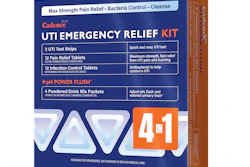
To further enhance usability, the redesign introduces a symptom-based color system across product categories so that consumers can quickly identify the right product both in-store and at home.
“Color creates a family,” Graham says. “Red signals pain and fever, teal is cough and cold, green is allergy, purple is sleep, blue is digestive, so people know they’re shopping for a specific thing,” she adds. “And when they’re lined up in your medicine cabinet, they look really nice too.”
Beyond aesthetics, the redesign was built with scalability in mind.
“The biggest challenge was creating a color system that could grow with us,” says Graham. “We don’t plan on getting smaller, only bigger.”
 Genexa
“Color became a very hotly contested topic,” she adds with a laugh. “People have very strong opinions—yellow, for example, is surprisingly polarizing.”
Shifting the Design Focus
Polarizing or not, the use of color is fundamental to the redesign, as is the move away from the character illustrations previously featured on Genexa's packaging. By moving away from the beloved characters, the team shifted its focus toward the purchaser, which is parents, not children.
“That was one of the biggest challenges,” Graham admits. “We wanted to maintain the warmth and trust our loyal customers associate with us. But parents are the ones shopping for their children’s medicine,” she says. “We don’t necessarily want kids thinking about medicine all the time. We want them thinking about playing and being well.”
In place of characters, Genexa introduced a new visual element, what the brand refers to as the “spark of relief.”
“It represents that moment when your child starts to feel better…the sigh of relief when the fever finally breaks,” Graham explains.
As a brand built on clean-label principles, Genexa also used the redesign to highlight its differentiation more clearly.
“We started to put the flavor in terms of the ingredients we use like real blueberry, real agave, real chamomile,” Graham says. “We wanted to front-load that on the pack.”
These claims sit alongside prominent “0% artificial additives” messaging, reinforcing the brand’s core value proposition. However, Genexa was careful not to downplay efficacy.
“It’s as important for us to signal the active ingredient, let’s say the acetaminophen, as it is our natural flavoring,” she notes. “Parents want both: effectiveness and alignment with their values.”
For OTC products, packaging carries the weight of serving as both marketing vehicle and regulatory document.
“In CPG, packaging is everything; it’s your most effective billboard,” Graham says. “That said, you have a lot that you have to fit on there,” she explains. “So, for us, it was about organizing that information in a way that was extremely easy to understand, while still leaving room for the pack to breathe.”
The result is a design that balances compliance with clarity, using white space to communicate simplicity. But simple design aside, at its core, the redesign reflects Genexa’s broader mission: supporting families during difficult moments.
“As an organization that serves families in some of their toughest moments, it’s nice to be able to offer a bright spot,” Graham says. “If we can be a small part of helping everyone feel better, that’s a really great thing.”