From the original recipe created and served locally in the Hot Gossip Lake Tahoe coffee shop in 1995, Tahoe Trail Bar has developed a reputation as the go-to snack for all kinds of outdoor sports and adventure, with high-quality ingredients and fantastic taste.
When Wes King, the owner and CEO, bought the recipe for the single flavor and rights to make the product in 2010, the nutrition, health, and wellness category was growing exponentially. He realized it was time to get Tahoe Trail Bar introduced to a wider audience.
King reached out to Perspective: Branding for the rebrand.
“We were struggling to be seen in the set because of muted colors, and finding it difficult to convert sales because the features of the bar were not clear, and our brand identity didn’t have the weight and punch of a separate mark. We decided to take the plunge into new flavors, which our customers were requesting, and take the brand as a whole ‘down to the studs’ and really capture who we are and what we are about,” King says.
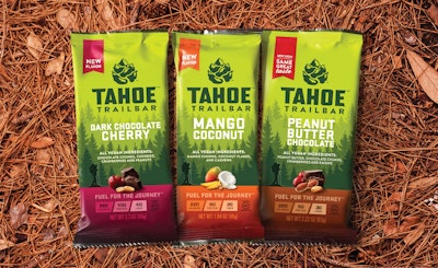
“Our main goal was to create a striking image for Tahoe Trail Bar that authentically captured the potential of the brand,” says Simon Thorneycroft, Founder and CEO of Perspective: Branding. “The brand redesign focuses on the positioning—‘fuel for the journey’—creating a vibrant visual identity that consumers across the country can identify with. We brought it to life with a pinecone mountain logo, along with a mountain trail, to illustrate the unique destination, thereby connecting it to the fuel that consumers need to complete the journey.”
After an extensive strategic visual audit of the bar category, Thorneycroft determined that the existing muted green color of the brand should be brightened to a rich, saturated green, allowing it to stand out in the crowded category and creating a billboard effect. He also adapted the identifiable image of the hiker from the previous version of the single package, but made it smaller and more in harmony within the context of the new mountainous background setting. Ingredient icons were added to increase appetite appeal and reinforce the health benefits of the products.
“Our expectations are to massively increase sales and shelf visibility, while encouraging better placements by having a world class packaging design,” King says. “We are already seeing greater acceptance from retailers in not only carrying the original product, peanut butter chocolate, but also taking the two additional flavors, dark chocolate cherry and mango coconut. They are now seeing Tahoe Trail Bar as a brand and not just a random, one-off product, regardless of how good it was.
“Perspective: Branding brought years of experience, fantastic design sense, and a hands-on collaborative process to the table; ultimately, they brought forth my brand and gave it a head start on achieving its true potential. I could not be more enthusiastic and appreciative for the results and impact in the marketplace that this rebranding/packaging redesign has created.”
The new packaging and flavors are currently being shipped to Whole Foods, Safeway, Raley’s, Scolari’s, Sports Basement, and Nugget Markets, among other retailers and new distribution channels that will be disclosed in the future.