99designs is an online graphic design marketplace that connects freelance designers with businesses seeking everything from package design to logos/logo contests to websites to individual products.
Examples of design trends are shown on its website, illustrating an article in which author Martis Lupus notes 10 packaging trends. Says Lupus, “There’s no escaping it, but thankfully packaging design is evolving every year to meet our changing needs and wants. At the forefront of those needs and wants is our reliance on e-commerce.”
Below, 99designs’ CMO Pam Webber provides the following six package design trends for the coming year.
1. Simplicity
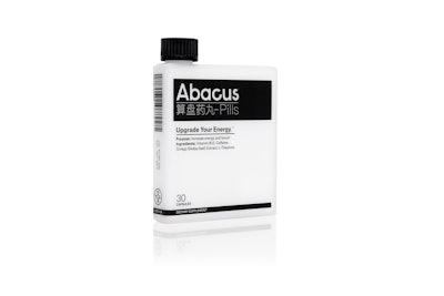
Minimalist design has been around for some time now and it’s not going anywhere soon. Although it can come across as somewhat abstract and primitive, keeping it simple plays an important role in helping us access our intuitive side. The hardest part about going minimal is finding symbols and signs that many people can relate to. Once you’ve nailed the symbolism, the message explains itself, often with few-to-no words. If you can pull it off, using less language will keep you in sync with our fast-paced society—people will barely have to slow down to grasp what your product is all about.
2. Pastels
Feminine, calming package design is moving into the spotlight in 2018, which means that pastels are seeing a resurgence. Pastels feel like a natural reaction to the hyper-stimulating and explosive colors we’ve been experiencing. They speak to our softer side. The reduced saturation makes pastels a great choice for creating a soft, pale effect that gives products a candid and warm aura, which is translated into a pleasant and welcoming message for the potential customer. Instead of being rushed and dazzled in order to look, touch, smell or taste and eventually buy, we’re being gently eased into it. Ahhhhh! These easy shades remind us that color is light and light is energy. And the energy we materialize has an impact.
3. Doodles
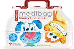
Everybody doodles—from 9- to 90-year-olds, so you’re set as far as target markets are concerned. Adults relate to this kind of free form drawing because it reminds us of the energetic, happy-go-lucky kids that we all were once. And let’s be honest: a good doodle can turn a frown upside down any given day. When seen on packaging, doodles can turn a product into a fun universe that was born from someone’s imagination and shared with the world. They also have a wonderful way of describing what’s inside the box. Many times we’re smiling before we even touch the product.
4. Standout shapes and materials
For the ones that aren’t about words or pastel colors, but all about innovative shapes and materials—you’re in luck! This approach falls under the “extreme packaging” category, but in a good way. Turning your juice can into a bamboo segment or your resin package into a sheltering tree stump, literally means that the only thing left to do is place your logo on the package. No other words required. This method showcases the thoughtfulness and ingenuity your product brings to the market—always something to aim for when building a brand identity.
5. Vintage
You can’t go forward without knowing your past. The past is ingrained in our current collective reality, which is why vintage design thrives on us remembering. Throwback design give us a little something that was left behind: an essential part of our culture or memories. Vintage design is also an effective way of demonstrating dedication to a certain level of quality, perhaps unaltered since the inception of the product, decades or centuries back. Vintage tells a story of tradition, respect and passion, elements that remain alive—from a design standpoint—through organized structure, dense details and strong, lasting identity.
6. Vibrant gradients
Since the rise of flat design, gradients have been dormant, waiting for the “right time” to make their return. Now, the use of gradients seems to be making a comeback. We are seeing more and more colorful gradients, adding depth and form to package design.
