Say good-bye to the sterile, conventional design of first aid products and packaging. Eric Ryan, Co-Founder of household cleaning and personal care products company Method, which blazed a trail in 2000 with its style-forward packaging and eco-friendly formulas, and of disruptive, design-savvy vitamin brand Olly has turned his attention to reinvigorating the first aid category with the introduction of Welly Health PBC.
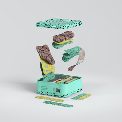
The company’s innovative, new 25-SKU first aid products line was introduced in April 2017 exclusively at Target and on Target.com. The brand comprises premium bandages and first aid products cushioned in exuberantly-decorated, stackable, and reusable tins that Welly says blend function with fun and encourage play by enabling preparedness.
Says Ryan, “When we looked at first aid options, we saw a hugely stagnant category with products that were either geared towards children or meant to blend in, hidden in a way. Healthcare and self-care are such important components to your overall lifestyle, and we wanted to apply that thinking to this everyday necessity. Cuts and scrapes are often a result of getting out into the world, exploring, and living to the fullest—that should always be celebrated.”
With playfully-named products such as Handy Bandies, Itch Fix, Oops Equipment, and Bravery Badges combined with patterned container and product designs—among them polka dots, rainbows, and leaves—Welly clearly telegraphs its philosophy that “bumps and scrapes are to be celebrated, never hidden.”
Design considerations
The Welly brand concept was the brainchild of Ryan and Co-Founder Doug Stukenborg, a former retail merchandising executive. “Eric has seen success in taking brands that haven’t had innovation in decades and creating disruption that adds value to the customer. Doug had worked in OTC in Target and saw the success of Eric’s approach to the vitamin category with Olly and had a huge passion for creating products that blend form and function,” explains Laura Conlon, VP Marketing for Welly Health PBC. “Together, they saw opportunities to combine premium materials with bright colors and bold designs to reach an audience that is ready to embrace their cuts and scrapes as badges of a life well lived.”
To bring their vision for a first-aid brand that puts play back into the category, the co-founders enlisted the help of branding agency Partners and Spade and structural design firm Prime Studio. From concept to store shelf, the project took just over a year to complete.
Explains Stukenborg, Welly’s unique packaging format of a tin with lid was created in response to consumer comments that, with traditional first aid products, “they often did not have what they needed when and where they needed it.” He adds, “We saw an opportunity to improve portability, storability, and findability through thoughtful packaging innovations.”
Prime Studio took the lead on designing the secondary packaging, considering many different requirements before choosing the final format. “We knew we wanted to incorporate modularity, but the question was how much should it drive structural design?” says Prime Studio founder Stuart Harvey Lee. “We also considered different use case scenarios—home, office, travel—as well as different possible storage cases—drawer, medicine cabinet, gym bag—and the different requirements for each case.”
Prime Studio also considered how iconic the design should be. “We wanted something instantly recognizable but not at the expense of efficiency and ease of use, while also considering efficiency at retail, both in terms of ease of planogramming and product navigation for the consumer,” Lee says.
Also high on the list was the selection of appropriate materials. “We knew we wanted to develop structural packaging that was more premium and consumer friendly than a paperboard box, but the question was, just how premium was appropriate?” Lee adds.
Several different packaging materials were evaluated, including molded pulp and tin/pulp hybrids. Plastic was a non-starter, Lee says, “because it didn’t sit well with the feeling the brand was trying to cultivate.” Ultimately, the idea of a tin exterior coupled with molded-pulp inserts to aid with product organization and an enhanced user experience won over all parties involved with the project.
Tin container ticks all the boxes
Nostalgia, modularity, stackability, findability, premium aesthetics, reusability, sustainability, and portable, on-the-go convenience: the tin container met all of Welly’s requirements, and more. “The tin has a long history in the first aid world, which unfortunately has disappeared for the most part,” says Lee. “We wanted to bring back that magic and develop a package that people would actually repurpose and reuse rather than recycle.”

For shelf-impact, the container can be decorated in many ways. It is also waterproof and sturdy enough to throw in a purse or glove compartment. Says Conlon, “Being able to use the tin and organization systems to easily bring first aid supplies on adventures or have them organized at home was a clear home run for the consumer.”
Two tin sizes were developed: a full tin, measuring approximately 3.75 in. L x 3.75 in. W x 1.5 in. H, and a half tin, which is approximately 4 in. L x 1.5 in. W x 1.5 in. H. The lid for the full-size tin is removable, while the lid for the half-size container is hinged—a feature Prime Studio deemed best through prototyping.
Debossing and embossing enable stackability of the full tins. On the top is a debossed shape of an X with rounded edges—the Welly brandmark—which Lee says has many meanings. “It is derived from the classic red first aid cross, but it can also mean a kiss, as in ‘kiss it better,’” he explains. Embossed within the X shape isthe Welly logo mark. The bottom of the tin is embossed with the same X, allowing it to fit nicely on top of another tin within the debossed area. For the half tin, the Welly logo is embossed on the top of the container.
Inside the containers, custom molded-fiber inserts organize and hold the products in place. Says Stukenborg, “The stackable nature of our tins helps people navigate to what they need. Inside the tins, we separate sizes to help them quickly find the right bandage for the current need.”
According to Lee, while the idea of stackable tins sounds simple—“because it is”—it took a tremendous amount of work to optimize the form factor to work with such a wide variety of contents.
Vibrant, playful presentation
Collaborating closely with Prime Studio and Welly Health PBC, Partners and Spade designed all the graphics and patterns for the brand. According to founder Anthony Sperduti, the firm was “inspired by the vibrant colors of the outdoors and a general overall exuberance and optimism.”
With 25 SKUs, the colors cover the spectrum, from bright tones of blue, orange, brown, purple, red, and yellow to more subdued hues such as beige, mint green, and pale pink and blue, among others. Patterns vary as well. For example, they include stripes (Bumper Stickers), polka dots (Handy Bandies), flowers (Bravery Badges standard bandages), and a rainbow and cloud design (Kids Bravery Badges). A number of tins are also solid in color. Products inside each tin reflect the patterns and colors used for the outer package.

A paperboard sleeve wraps each tin and is decorated with the Welly logo mark, illustrations of the products inside, and product information. Says Sperduti, the logo mark, which uses lower-case letters in a script-like font, was designed to give a slight nod to the past, in the same way the tin does. “It speaks to the well-crafted, premium nature of the brand,” he notes.
On two side panels of the tin, the container is decorated with icons that illustrate the products held within, along with a description of the contents, printed in white. When the tins are stacked in a medicine cabinet, for example, these descriptors make it easy for consumers to navigate to the right product.
The tins are printed in two to six colors, depending on the product, plus a secondary gloss coating, which gives the containers a smooth, premium feel. TinWerks supplies the tins.
Target market
In the tradition of Method and Olly, Welly is initially being sold exclusively through Target and Target.com. Explains Conlon, “This allows us to make a bigger impact with one audience, learn from what people want, and move forward. We’ve been able to bring a really robust experience to the Target guest with beautiful endcaps, a wide assortment of products, and detailed information online at Target.com. While Welly is uniquely instagrammable, it is also a wonderful product to discover in a brick-and-mortar store.”
Target is equally as pleased with the exclusivity. Said Christina Hennington, Target’s Senior Vice President, General Merchandise Manager, Essentials, Beauty, Hardlines and Services, at the time Welly was launched, “We have a history of bringing innovative products to market with the team behind Welly—first with Method in 2002, and later with Olly in 2016. The introduction of Welly into our assortment is another example of how we’re continuing to differentiate our Essentials business with products we know our guests will love.”PW
Debossing on the top of the full tin and embossing on the bottom enable the containers to be stacked.
