Lornamead has done just that, and achieved a 10% increase in unit volume prior to a promotional campaign for its Finesse lineup of shampoo, conditioner, and styling products. The company has succeeded by following three steps involving packaging: It has evolved the brand’s communication structure, simplified the communication, and maximized the strengths of each package surface—plastic, aluminum, and steel.
After purchasing the Finesse brand and doing consumer research, Lornamead determined that women ages 35 to 54—the brand’s core audience—were “open to giving Finesse another try,” says Karen Murabito, Lornamead group brand director. “But their memories of the brand were old, so we needed to make it more contemporary. People remember the blue package, but we needed to make the brand easy to shop.”
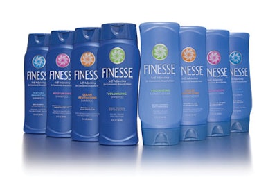
Lornamead, working with Little Big Brands (www.littlebigbrands.com) to drive the overall design approach, accomplished this objective by moving to a flatter container for its 13-oz and 24-oz bottles. The smaller size has been reduced from 15 oz, and the new bottle structure provides additional economies by using the same cap and label size for both the small and large containers. For the shampoo and conditioner, the design of the high-density polyethylene bottles, from Silgan Plastics (www.silgan.com), enhances the bottles’ flask-like shape. An exaggerated “foot” provides support at the base of the custom-shape bottles. The shape is inverted for the conditioner bottle, Murabito notes, to easily identify the shampoo and conditioner containers in the shower.
The design across the family of Finesse products retains the visual equity in the brand’s signature blue color but introduces a “self-adjusting” icon, which Lornamead refers to as “the burst.” The design also aligns on-pack communications to create stronger brand-blocking on shelf.
The burst, Murabito says, is critical in creating the visual movement that communicates the self-adjusting properties of each product formula. The color of the burst matches the color of the text signaling each product variety. Together, they improve the shoppability of each product.
Stronger brand-blocking also draws attention to the 23-SKU product family. A significant decision was to anchor the burst on the same horizontal plane for all packages. Finesse is a relatively long brand name, says John Nunziato, creative director, Little Big Brands, so it has been vertically stretched to improve readability.
Besides the plastic shampoo and conditioner bottles, the Finesse lineup includes aluminum cans of mousse from CCL Container (www.cclcontainer.com) and steel cans of hairspray, from Crown Cork (www.crowncork.com). Each presented different printing challenges, which is evident in areas such as the silver border ring that enhances the burst’s visual impact against the blue package surface, Murabito explains. Lornamead consulted Inwork (www.inworkinc.com) for comparative analysis testing to get the best impact from the silver ring on each package structure. National Label (www.nationallabel.com) prints the silver color using UV flexography and silk screening on a pressure-sensitive label applied to the plastic bottles. The ring area is left unprinted on the steel cans to expose the metal surface.
“We wanted to use the aluminum surface in this same way as well, but the aluminum cans are printed dry offset, and with dry offset, you can’t use spot-white color behind the variant and icon. So, we had to move to a dry offset-printed silver on the aluminum,” Murabito says.
Finally, a matte finish completes each package, and fluorescent pigments enhance the inks on the steel cans, to maximize the luster on the packages as they sit on dimly lit store shelves.
By marrying form and function, Lornamead has revived a classic brand based on parameters set by talking directly with target consumers. Finesse not only has retained the core equity in its blue packaging, but also has visually fine-tuned a classic brand to make it relevant for today’s consumers.
