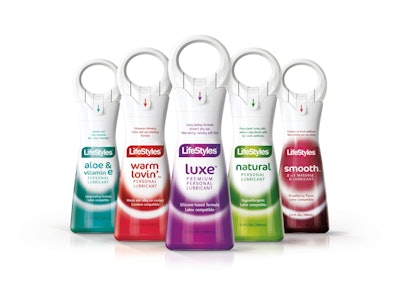
A project involving the restyling of both graphics and structural packaging for Ansell Ltd.’s range of Lifestyles, Manix, and Unimil personal lubricant gel brands produced by multinational company Ansell Ltd. is helping the product to stand out, arouse curiosity, convey a sense of trust, all with a sensitive and sophisticated touch of sensuality.
Ansell, a designer, developer, and manufacturer of a range of hand and arm protection, clothing, and condoms, has recognized the importance of packaging for years. And its new line of personal lubricant package design hasn’t gone unnoticed. The original graphic and structural packaging, designed by Reverse Innovation, recently earned the Good Design Award by Chicago Athenaeum Museum (Graphics/Identity/Packaging category); the Brand Identity Grand Prix by TVN Media Group (Pharmaceutical/Healthcare category), and Mediastars by Media Star Editore (Non-Food-Coordinated Series).
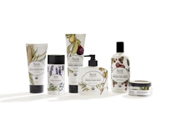
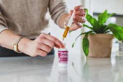
The structural packaging of this product is so original that a patent registration has been applied for to protect it. “Stability and sensuality” are coupled in the container’s distinctive shape. The iconic design reinforces the brand’s identity and marks an innovative development in the visual language of the product category. The delivery mechanism is ergonomic, allowing instant and easy control over the flow of the gel. The ring on the top gives the product its distinctive character and outline and also functions as a playful handle. The security seal guarantees the safety of the contents for the customer. The product is available in 50-mL and 100-mL sizes.
Although supplier details are considered proprietary, packaging consists of a blow-molded HDPE or PETG container and an injection-molded pump that includes polypropylene, polyethylene, and stainless steel.
Alice Tacconi, partner of Reverse Innovation, notes, “The bottles are developed in two different types to hold different chemical formulations: HDPE (opaque white) or PETG (transparent and colorless). The bottles are covered with a heat-shrinkable sleeve, which partially covers the pump. This sleeve has an easy opening with precut, and a single gesture allows you to open the seal. Compared to previous bottles there has been an optimization in terms polymer weight, thanks to the type of form and its design. The pump has been designed and developed to be multi-material but with optimization of materials: PP, PE, and stainless steel.”
The graphic restyling aims to communicate the main information consumers need. Five carefully selected colors identify the fragrances. The blushing tonal gradients represent the rising sensation of pleasure. On the shelf, the product’s elegant silhouette catches the eye, while the simple graphics inspire a sense of trust. No one will feel embarrassed picking up the discreet product and putting it in their shopping cart.