Introduced in the 1980s as a cosmetic alternative to traditional lip balm products, the Softlips brand of lip conditioners from The Mentholatum Company was a big hit with teens upon its launch, but as its customers aged, so did its blister-carded packaging.
"Graphically, the packaging was looking tired and lacked impact at shelf," says Marcus Hewitt, chief creative director at Dragon Rouge, the brand and design consultancy tasked by Mentholatum to reposition the brand for growth. "The brand name itself was rendered in a dated script and sloped down off the pack. Artificial-looking ingredient illustrations were not communicating the style or functional benefits of the product. The graduated background coloring made the packs look faded."
Mentholatum requested that Dragon Rouge develop a design platform that would appeal to contemporary, young adults and would reflect a positioning built around "fueling femininity," Hewitt explains. Additionally, the lines-there are four in all, comprising more than 50 flavors-needed to be easier to shop, deliver impact on shelf, and enhance benefit communication (flavor, fragrance, finish, SPF protection, organic, etc.)
Consumer research identified two core consumer groups: sophisticated teenagers and young women looking to assert their femininity. "Much of the discussion was focused on self expression/creativity and fashion/style," recalls Hewitt. A first round of research helped focus on identifying the brand idea of natural expression, while a second helped determine which design cues-a greater use of white, crisp photography, more confident typography, and simpler, more contemporary cues-did the best job of communicating the brand idea.
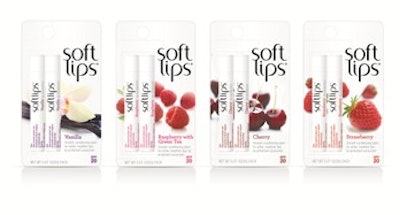
With color and photography variations used to reflect each of the four lines' specific propositions, including flavors, tints, naturals, and therapeutics, the winning graphic design for the blister cards features high-impact, limited depth-of-field photography of natural ingredients and a contemporary identity that features the brand name stacked in two lines. Hewitt says the new script treatment emphasizes the name's meaning, as well as increases impact. Primary packaging is a slim, white tube selected to express the product's natural essence.
Launched in stores in spring 2011, the repositioned packaging has been met with an "overwhelmingly positive" response, shares Hewitt. "Mentholatum does not share financial results," he adds, "but store-on-store results are up, and the new redesign has opened the door to new retailers for Mentholatum." -Anne Marie Mohan, Senior Editor
"Graphically, the packaging was looking tired and lacked impact at shelf," says Marcus Hewitt, chief creative director at Dragon Rouge, the brand and design consultancy tasked by Mentholatum to reposition the brand for growth. "The brand name itself was rendered in a dated script and sloped down off the pack. Artificial-looking ingredient illustrations were not communicating the style or functional benefits of the product. The graduated background coloring made the packs look faded."
Mentholatum requested that Dragon Rouge develop a design platform that would appeal to contemporary, young adults and would reflect a positioning built around "fueling femininity," Hewitt explains. Additionally, the lines-there are four in all, comprising more than 50 flavors-needed to be easier to shop, deliver impact on shelf, and enhance benefit communication (flavor, fragrance, finish, SPF protection, organic, etc.)
Consumer research identified two core consumer groups: sophisticated teenagers and young women looking to assert their femininity. "Much of the discussion was focused on self expression/creativity and fashion/style," recalls Hewitt. A first round of research helped focus on identifying the brand idea of natural expression, while a second helped determine which design cues-a greater use of white, crisp photography, more confident typography, and simpler, more contemporary cues-did the best job of communicating the brand idea.
With color and photography variations used to reflect each of the four lines' specific propositions, including flavors, tints, naturals, and therapeutics, the winning graphic design for the blister cards features high-impact, limited depth-of-field photography of natural ingredients and a contemporary identity that features the brand name stacked in two lines. Hewitt says the new script treatment emphasizes the name's meaning, as well as increases impact. Primary packaging is a slim, white tube selected to express the product's natural essence.
Launched in stores in spring 2011, the repositioned packaging has been met with an "overwhelmingly positive" response, shares Hewitt. "Mentholatum does not share financial results," he adds, "but store-on-store results are up, and the new redesign has opened the door to new retailers for Mentholatum." -Anne Marie Mohan, Senior Editor