When designing packaging for products in highly regulated categories such as medical devices, cosmetics, and drugs-and constantly being warned "you can't do that" or "that doesn't meet regulations"-designers may feel like they are working with one hand tied behind their back.
Yet, despite increasing constraints and the sometimes-subjective nature of government and industry regulations, it is possible to be a "design Houdini"-to ease (if not entirely escape) the ties that bind and create breakthrough package designs that break through the clutter on store shelves. Doing so requires a thorough understanding of how to incorporate government or industry regulations as part of a sound design strategy and architecture; in other words, to use on-pack restrictions to the brand's advantage.
While designers are accustomed to working under the strictures of a design brief or basic packaging guidelines, accommodating certain regulatory and industry restrictions can be quite daunting. The healthcare industry has some of the most stringent product packaging rules. Of particular note are:
• Size and formatting regulations: The U.S. Food and Drug Administration requires that an over-the-counter drug's list of active ingredients and product descriptors be in a particular size (sometimes half, sometimes a quarter) in relation to a panel's largest printed matter (which isn't always, as one might think, the brand's primary logo).
• On-pack hierarchies: Developing a healthcare product's package design architecture can be a challenge because regulations dictate the positioning of certain on-pack visual and verbal elements. It wouldn't be so bad if the regulations allowed most of the information to reside on secondary panels; however, quite a few mandatories refer specifically to what has to appear on the principle display panel (what the consumer sees first on shelf).
• Warnings: FDA and company mandates regarding the use and formatting of product warning language can be very restrictive. While most formatting regulations aim to enhance consumer understanding, some regulations around warnings-especially for products that are ingested-are so prescriptive and the accompanying language so extensive that they actually cause confusion at shelf. It's analogous to the format of television commercials for prescription drugs: These spend a few seconds to state how a product can address a particular health problem then use the bulk of air time to describe its potential side effects. Now, imagine having to state all the good things an OTC drug can do as well as all the bad things that might happen on a label that is 3 in. x 3 in. or smaller.
• Shrinking structures: As companies strive for cost savings, package structures (footprints) are getting smaller and smaller. Increasing the size of existing structures to accommodate regulated information typically is not an option. Yet, designers are still expected to deliver great design and adhere to all government and industry regulations in the reduced space.
Here's a real-world example of a healthcare industry packaging design regulation: When the FDA published its labeling changes regarding acetaminophen, product manufacturers were presented with the following list of design mandatories:
• "That the ingredient acetaminophen is prominently identified on the product's principal display panel (PDP) of the immediate container, and the outer carton (if applicable). This is intended to help consumers identify the active ingredient and reduce the number of consumers [who are] inadvertently exposed to multiple products containing acetaminophen.
• That the product label contain new warnings that highlight the potential for liver toxicity and warn consumers against using more than the recommended dose of acetaminophen; using more than one product (OTC or prescription) containing acetaminophen, and taking acetaminophen with moderate amounts of alcohol.
• That the product label contain a warning not to use acetaminophen with any other drug containing acetaminophen and to ask a doctor or pharmacist if persons are not sure whether a drug contains acetaminophen, a warning to ask a doctor before use if persons have liver disease, and a warning to ask a doctor or pharmacist before use if persons are taking the blood thinning drug warfarin.
• That the statement "see new warnings information" appears on the product's PDP for one year after the final rule is published.
• We believe the flag must be prominent and proposed the minimum size to be one of the following, whichever is larger: At least one-quarter as large as the most prominent type size or at least as large as the size of the 'Drug Facts' title (21 CFR 201.326(b)).
• We believe this proposal ensures that consumers will see the flag while allowing manufacturers labeling flexibility. Furthermore, we believe that it is more important to make consumers aware of new warning information than it is of other promotional material such as "new taste."
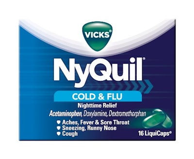
The NyQuil design shown here is an example that strives to bring this regulation to life on-pack. They feature different, functional interpretations of the design mandatories.
Not only are certain industries' design regulations extensive, the way they are worded is, at times, somewhat subjective; this leaves them open to interpretation. It's not an exaggeration to say that a company's legal and regulatory departments play a huge role in package design for highly regulated categories. This is not an ideal situation for designers because it adds a layer of complexity and ambiguity to the design process, but it is a reality in today's information- and regulation-driven marketplace.
Make like Houdini
Marrying the functional with the aesthetic is a challenge when developing product packaging in highly regulated industries. However, designers who proactively incorporate government, industry, or corporate mandates into their design strategy can make like Houdini and escape the confines of design drudgery. Here are some ways to use on-pack regulations to a brand's advantage:
1. Clearly understand all regulations before beginning the design process. Seek guidance from the client's regulatory and legal departments to get a historical perspective (especially if the project is for a new market, client, or product), resolve any issues or ambiguities, and discuss if and where the design can "push the envelope."
2. If the client or agency has a style guide that includes regulated information, use it; if not, create one as the project unfolds to make the next assignment easier. Careful preplanning can translate into a design that is not only breakthrough aesthetically, but breakthrough in its functionality and benefit communication.
3. "Design" the regulated information concurrently with the packaging aesthetics. Oftentimes, warnings, and other required text is downplayed or omitted from initial design concepts in order to "sell-in" the design (i.e., submit something beautiful to the client first and then "clutter" it up with all the mandatories). Truth be told, the consumer will never see the package in such a pristine fashion, so it is better to incorporate all the information and guidelines up front when they can contribute to the overall design. For example, color can be an extremely useful design element: The FDA regulates contrast levels in the "Drug Facts" information, and this contrast can be leveraged in the design aesthetic to create clear spaces to hold critical information.
4. Strive for clarity and simplicity. Since on-pack real estate is limited and government regulations generally preclude verbal creativity, focus on communicating a product's benefits in a clear and concise manner. Establish a hierarchy of verbal and visual communication, within the framework of a beautiful design, to inform and connect with consumers.
Escape the ties that bind
Designers shouldn't let regulatory constraints prevent them from creating packing that is beautiful, functional and relevant. Designers who understand how to use design mandatories to their advantage and employ some creative magic-such as color, clear versioning, benefit communication, and effective eye tracking-can escape the ties that bind.
Article provided by Jean Campbell, brand identity director at Interbrand. Campbell oversees brand identity and design implementation for Beauty, Family and Healthcare clients; she also manages the implementation designers working in these categories. She counsels the creative staff on brand equity usage (and packaging regulations) and ensures that equities are used accurately and consistently. She has worked in the branding and design field since 1986, joining Interbrand in 1994 as a promotional designer.
Yet, despite increasing constraints and the sometimes-subjective nature of government and industry regulations, it is possible to be a "design Houdini"-to ease (if not entirely escape) the ties that bind and create breakthrough package designs that break through the clutter on store shelves. Doing so requires a thorough understanding of how to incorporate government or industry regulations as part of a sound design strategy and architecture; in other words, to use on-pack restrictions to the brand's advantage.
While designers are accustomed to working under the strictures of a design brief or basic packaging guidelines, accommodating certain regulatory and industry restrictions can be quite daunting. The healthcare industry has some of the most stringent product packaging rules. Of particular note are:
• Size and formatting regulations: The U.S. Food and Drug Administration requires that an over-the-counter drug's list of active ingredients and product descriptors be in a particular size (sometimes half, sometimes a quarter) in relation to a panel's largest printed matter (which isn't always, as one might think, the brand's primary logo).
• On-pack hierarchies: Developing a healthcare product's package design architecture can be a challenge because regulations dictate the positioning of certain on-pack visual and verbal elements. It wouldn't be so bad if the regulations allowed most of the information to reside on secondary panels; however, quite a few mandatories refer specifically to what has to appear on the principle display panel (what the consumer sees first on shelf).
• Warnings: FDA and company mandates regarding the use and formatting of product warning language can be very restrictive. While most formatting regulations aim to enhance consumer understanding, some regulations around warnings-especially for products that are ingested-are so prescriptive and the accompanying language so extensive that they actually cause confusion at shelf. It's analogous to the format of television commercials for prescription drugs: These spend a few seconds to state how a product can address a particular health problem then use the bulk of air time to describe its potential side effects. Now, imagine having to state all the good things an OTC drug can do as well as all the bad things that might happen on a label that is 3 in. x 3 in. or smaller.
• Shrinking structures: As companies strive for cost savings, package structures (footprints) are getting smaller and smaller. Increasing the size of existing structures to accommodate regulated information typically is not an option. Yet, designers are still expected to deliver great design and adhere to all government and industry regulations in the reduced space.
Here's a real-world example of a healthcare industry packaging design regulation: When the FDA published its labeling changes regarding acetaminophen, product manufacturers were presented with the following list of design mandatories:
• "That the ingredient acetaminophen is prominently identified on the product's principal display panel (PDP) of the immediate container, and the outer carton (if applicable). This is intended to help consumers identify the active ingredient and reduce the number of consumers [who are] inadvertently exposed to multiple products containing acetaminophen.
• That the product label contain new warnings that highlight the potential for liver toxicity and warn consumers against using more than the recommended dose of acetaminophen; using more than one product (OTC or prescription) containing acetaminophen, and taking acetaminophen with moderate amounts of alcohol.
• That the product label contain a warning not to use acetaminophen with any other drug containing acetaminophen and to ask a doctor or pharmacist if persons are not sure whether a drug contains acetaminophen, a warning to ask a doctor before use if persons have liver disease, and a warning to ask a doctor or pharmacist before use if persons are taking the blood thinning drug warfarin.
• That the statement "see new warnings information" appears on the product's PDP for one year after the final rule is published.
• We believe the flag must be prominent and proposed the minimum size to be one of the following, whichever is larger: At least one-quarter as large as the most prominent type size or at least as large as the size of the 'Drug Facts' title (21 CFR 201.326(b)).
• We believe this proposal ensures that consumers will see the flag while allowing manufacturers labeling flexibility. Furthermore, we believe that it is more important to make consumers aware of new warning information than it is of other promotional material such as "new taste."
The NyQuil design shown here is an example that strives to bring this regulation to life on-pack. They feature different, functional interpretations of the design mandatories.
Not only are certain industries' design regulations extensive, the way they are worded is, at times, somewhat subjective; this leaves them open to interpretation. It's not an exaggeration to say that a company's legal and regulatory departments play a huge role in package design for highly regulated categories. This is not an ideal situation for designers because it adds a layer of complexity and ambiguity to the design process, but it is a reality in today's information- and regulation-driven marketplace.
Make like Houdini
Marrying the functional with the aesthetic is a challenge when developing product packaging in highly regulated industries. However, designers who proactively incorporate government, industry, or corporate mandates into their design strategy can make like Houdini and escape the confines of design drudgery. Here are some ways to use on-pack regulations to a brand's advantage:
1. Clearly understand all regulations before beginning the design process. Seek guidance from the client's regulatory and legal departments to get a historical perspective (especially if the project is for a new market, client, or product), resolve any issues or ambiguities, and discuss if and where the design can "push the envelope."
2. If the client or agency has a style guide that includes regulated information, use it; if not, create one as the project unfolds to make the next assignment easier. Careful preplanning can translate into a design that is not only breakthrough aesthetically, but breakthrough in its functionality and benefit communication.
3. "Design" the regulated information concurrently with the packaging aesthetics. Oftentimes, warnings, and other required text is downplayed or omitted from initial design concepts in order to "sell-in" the design (i.e., submit something beautiful to the client first and then "clutter" it up with all the mandatories). Truth be told, the consumer will never see the package in such a pristine fashion, so it is better to incorporate all the information and guidelines up front when they can contribute to the overall design. For example, color can be an extremely useful design element: The FDA regulates contrast levels in the "Drug Facts" information, and this contrast can be leveraged in the design aesthetic to create clear spaces to hold critical information.
4. Strive for clarity and simplicity. Since on-pack real estate is limited and government regulations generally preclude verbal creativity, focus on communicating a product's benefits in a clear and concise manner. Establish a hierarchy of verbal and visual communication, within the framework of a beautiful design, to inform and connect with consumers.
Escape the ties that bind
Designers shouldn't let regulatory constraints prevent them from creating packing that is beautiful, functional and relevant. Designers who understand how to use design mandatories to their advantage and employ some creative magic-such as color, clear versioning, benefit communication, and effective eye tracking-can escape the ties that bind.
Article provided by Jean Campbell, brand identity director at Interbrand. Campbell oversees brand identity and design implementation for Beauty, Family and Healthcare clients; she also manages the implementation designers working in these categories. She counsels the creative staff on brand equity usage (and packaging regulations) and ensures that equities are used accurately and consistently. She has worked in the branding and design field since 1986, joining Interbrand in 1994 as a promotional designer.