A shampoo and conditioner in one product for use by all family members is an unusual find in the hair-care category, whose retail shelves are typically cluttered with countless brands and product variations, micro-segmented to appeal to a range of demographics, hair types, and need states. While PERT Plus, introduced in 1987 as the first 2-in-1 shampoo/conditioner on the market, can claim this unique distinction, until recently its on-shelf presence was less than stand-out.
Says Ryan Lynch, managing partner of Beardwood&Co., "It looked and felt dated on the shelf. It was recessive, and consumers weren't considering it or picking it up." But a bold new brand identity developed by Beardwood&Co. for brand owner Idelle Labs now has the product popping off the shelves.
"The new PERT Plus packaging is 'refreshingly simple,' just like the product itself," says Beardwood&Co. partner and creative director Sarah Williams. "It has grab-and-go appeal at shelf that parents can feel great about bringing home to the family."
According to Lynch, Idelle was looking for a "level-eight" change in graphics, "with 10 being revolutionary." The bottle and cap structure had to remain the same, as Idelle had an existing contract with its container supplier, Alpha Packaging.
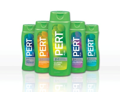
Central to the package refresh is a bold and modern logo, positioned vertically on the label and designed to reinforce the brand's promise of "Great Hair Made Simple." According to consumer feedback, the strong, vertical type also demonstrates renewed confidence in the brand. A fresh, eye-catching bubble pattern on the label background "signifies that the product actively works, so people don't have to think about it," says Lynch. "The strength of the graphics really helps combat the fact that PERT is usually stocked near the bottom shelf," he adds.
Bright colors-blue, teal, orange, purple, and light green-each represent one of five PERT Plus varieties for different hair types and "express the confidence and upbeat attitude of a great hair day," Lynch says. A prominent, horizontal silver bar calls out the 2-in-1 proposition in a noticeable, premium way. The new design is deliberately unisex in appeal, since Idelle recognized that PERT Plus is primarily used by dads and children, but is purchased by moms.
Commenting on the redesign, which was launched in fall 2011, Idelle director of marketing Rick Cutler says, "Beardwood&Co.'s packaging nailed the simplicity positioning, and our retailers and customers are loving the new look."
Says Ryan Lynch, managing partner of Beardwood&Co., "It looked and felt dated on the shelf. It was recessive, and consumers weren't considering it or picking it up." But a bold new brand identity developed by Beardwood&Co. for brand owner Idelle Labs now has the product popping off the shelves.
"The new PERT Plus packaging is 'refreshingly simple,' just like the product itself," says Beardwood&Co. partner and creative director Sarah Williams. "It has grab-and-go appeal at shelf that parents can feel great about bringing home to the family."
According to Lynch, Idelle was looking for a "level-eight" change in graphics, "with 10 being revolutionary." The bottle and cap structure had to remain the same, as Idelle had an existing contract with its container supplier, Alpha Packaging.
Central to the package refresh is a bold and modern logo, positioned vertically on the label and designed to reinforce the brand's promise of "Great Hair Made Simple." According to consumer feedback, the strong, vertical type also demonstrates renewed confidence in the brand. A fresh, eye-catching bubble pattern on the label background "signifies that the product actively works, so people don't have to think about it," says Lynch. "The strength of the graphics really helps combat the fact that PERT is usually stocked near the bottom shelf," he adds.
Bright colors-blue, teal, orange, purple, and light green-each represent one of five PERT Plus varieties for different hair types and "express the confidence and upbeat attitude of a great hair day," Lynch says. A prominent, horizontal silver bar calls out the 2-in-1 proposition in a noticeable, premium way. The new design is deliberately unisex in appeal, since Idelle recognized that PERT Plus is primarily used by dads and children, but is purchased by moms.
Commenting on the redesign, which was launched in fall 2011, Idelle director of marketing Rick Cutler says, "Beardwood&Co.'s packaging nailed the simplicity positioning, and our retailers and customers are loving the new look."