The functional food and beverage market has been growing at a dramatic clip as consumers increasingly recognize the instrumental role diet plays in a wide range of health conditions. So how does a new beverage claiming health and energy benefits differentiate itself in this ever-expanding category? That was the challenge facing design firm Monday Collective when Victoria, BC, Canada-based Rumble Drinks approached them in fall 2010 to create the brand strategy, brand identity, and package design for its new line of nutritional beverages.
The firm’s response? Buck the trend of visual clutter and bright graphics, and opt instead for a clean, fresh appearance achieved through minimalist, inspirational graphics and a unique aluminum bottle format. Explains Monday Collective founder Rochelle Martyn, “Rumble Drinks wanted the design to look natural, credible, and approachable, and communicate that consuming a healthy drink can be an enjoyable experience.”
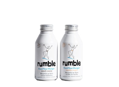
The Rumble line of two flavors was initially developed by founder Paul Underhill as a solution to his own health needs and includes natural ingredients such as protein blend, organic flaxseed oil, pomegranate, walnut oil, and green tea extract, among others. The brand tagline, “Feed Your Hunger,” expresses the drink’s aim of feeding healthy energy to hungry people looking to snack on the go.
Graphics for the 12-oz resealable, recyclable Alumi-Tek® bottle from Ball include a mostly black-and-white palette, with subtle hits of color, which Martyn says was chosen to create a bold visual identity that expresses Rumble’s natural confidence. The main design element is a hand-drawn character with arms raised to the sky holding the beverage can, “sketched to look natural, happy, and energized after drinking a bottle of Rumble,” says Martyn.
Of the freestyle artwork, Martyn says, “We explored inspirational character styles and illustrations with a natural and uplifting execution, using hand-drawn brushstrokes. We wanted Rumble to have a visual look that expressed the hands-on approach and passion behind its creation.”
Along with the jaunty character, the lowercase Rumble logo appears in “rumbled” letters at the bottom of the can to build on the idea of on-the-move. Color is used sparingly in the can graphics, for product variety information, a product benefit callout, the tagline, and a starburst graphic on the character’s stomach, “for an uplifting, outdoor vibe and freshness,” says Martyn.
Shelf-stable Rumble launched in natural and organic food stores in Canada in December 2012, with U.S. distribution planned for 2013. The drink has a suggested retail price of $3.99 per bottle.