Family-owned Quantum Health of Eugene, OR, has been in the natural health supplements market since 1981, offering products that aid in skin care, oral health, immune support, eye health, and more in over 35,000 stores in the U.S. and Canada. From the start, Quantum’s focus was to source only the highest-quality, research-supported ingredients to ensure product effectiveness.
Several years ago, the company realized while its product range was strategically positioned to take advantage of the growing wellness trend, its brand had not evolved over time and now lacked both the differentiation and the necessary natural cues to compete effectively on shelf. When Quantum approached brand design agency Trinity Brand Group for assistance in the fall of 2015, its existing packaging graphics had an OTC, drug store-medicine feel. At the time the graphics were developed, a popular perception among consumers was that by buying “natural,” they were sacrificing effectiveness.
Explains Laurie Kreisberg, Director, Strategy & Client Services for Trinity, early natural supplement brands such as Quantum used drug-store effectiveness cues at the expense of nature cues. “Their packaging graphics and communications were more in line with the Robitussin or Sudafed of old,” she says. “They included bold italics with lots of shouting statements on pack to express strength and effectiveness, lacking a clear communication hierarchy to help consumers shop its products within the context of a chaotic shelf.”
In addition, as Quantum had grown, so too had its product offerings, reaching into new categories. But the Quantum brand lacked a clearly defined system, which led to inconsistency in everything from sub-brand logo treatments and naming to benefit statements and romance copy.
“As a result, a consumer who would buy Quantum Elderberry syrup would likely have no idea that Quantum also makes a great Lysine product on shelf just five feet away,” explains Kreisberg. “The Quantum Health brandmark was recessive and, although technically on every package, didn’t provide a distinctive or navigable visual identity.” This led to a lack of brand loyalty by consumers, who engaged only on a product-by-product basis.
Trinity’s goal was to bring relevance to consumers, many of whom now saw natural wellness products as equally or more effective than the alternative. Following extensive initial strategy work, Trinity created a new design across Quantum’s offerings that expresses to consumers a more natural, premium, modern, and personal lifestyle brand.
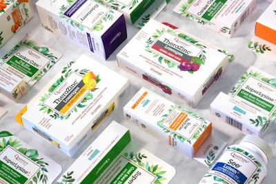
To convey Quantum’s holistic approach to health through a balance of science and nature, the new design features hand-painted, natural-feeling leaves that surround the information panel and communicate a distinctly natural product; a clean, white background that suggests a clinical efficacy using the modern, premium visual language of cosmeceuticals; and a thin-ruled, copper-colored wordmark that conveys premium-ness, but in its use of copper—rather than gold or silver—layers in a more natural, mineral-related character to the brand.
Other key elements suggest a human touch designed to convey the trustworthy and personal nature of the family-owned brand. Among these elements is the use of hand-done illustrations for both the brandmark leaves and the flavors to telegraph the care and thoughtfulness put into the products. A very structured information panel along with the color coding of products and sub-brands is used to organize information, making it clear and easy for consumers to shop and letting them know this is a brand they can trust to deliver the information they need. Another element of the design is a delivery-method icon system—ointment, syrup, lozenge, etc.—that Quantum can use on packaging where relevant to ensure consumers know exactly what product form they are purchasing.
“From a retail strategy standpoint, the new design system creates a clear hierarchy with enough flexibility built in to extend a strong visual brand architecture across a multitude of segments and SKUs,” says Kreisberg. “Color coding provides a simple, easy-to-shop solution for the different sub-brands.”
The new design for 101 SKUs across 11 Quantum sub-brands was rolled out into natural grocery stores such as Whole Foods Market and into supplement/health food stores, including Pharmaca and The Vitamin Shoppe, in August 2017. The launch was extremely well received as evidenced by Quantum’s overall double-digit sales growth, including more than 30% growth for one of its longstanding immune support lines.
Says Todd Howerter, VP Marketing for Quantum, “Since we launched the new branding, the new look has helped us gain new distribution, especially in Food Drug & Mass accounts, who feel our natural look is a differentiator. We also started doing business with Target for the first time and will be selling our Buzz Away [bug spray] line in all Target stores this year.”