Mexican quick-service restaurant Del Taco has introduced a new, integrated advertising campaign and brand design refresh, led by advertising agency Camp + King. The campaign, “Hardest Working Hands,” launched on June 25th, celebrates the cornerstones of the business: Del Taco employees’ pride and hard work.
The directive for Camp + King was to create a campaign and design that would elevate consumer perceptions of Del Taco to a be viewed as a better-quality option and would be uniquely Del Taco, separating and elevating the brand’s visual identity from the noise of the category.
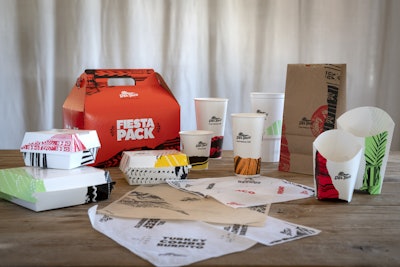
Says Camp + King, “Across the board, we simplified. We needed a system that wouldn’t clutter the consumer experience, especially when considering the high volume of design touchpoints across store artwork and packaging.” This comprised more than 60 pieces.
The new system features the following elements:
- Clean white backgrounds with minimal messaging that create a canvas that stands out from the category and lets the brand’s confidence shine.
- Abstract, hand-crafted background patterns that refresh and create a contemporary and bold aesthetic. The pattern designs are inspired by elements found in Southern California and Mexican culture like poncho patterns, palm fronds, and beach waves. Other patterns are inspired by the fresh ingredients found in Del Taco kitchens like avocadoes, tomatoes, hand-grated cheddar cheese, and pinto beans.
- A color palette that reflects the vibrancyofSouthern California'ssun, sky, water, and foliage. Paired with ample amounts of whitespace, the colors are amplified creating vivid and clean pieces.
- A bold but refined typography system that adds additional personality and expression.
The new design system has rolled out across Del Taco’s packaging, in-store artwork, print, digital, and social assets.