Bonding and creating memories with family and friends over ice cream is a tradition that motivates the Lindner family, owners of the United Dairy Farmers Stores and Homemade Brand ice cream. Launched in Cincinnati in 1939, the company operates more than 200 convenience and gas stores across the Midwest. Three generations later, they continue to craft their ice cream with quality ingredients, attention to detail, and care that remain the signatures of their UDF brand and Homemade Brand ice cream. Both brands can be found served in their own hand-dipped ice cream parlors, packaged in their UDF convenience stores, and sold in national and independent grocery retail chains.
With competition growing from national and regional competitors, UDF reached out to San Francisco-based Perspective: Branding to harness the emotion of the brand’s story.
“We needed someone who could translate the pride we have in our legacy brand to a complete redesign that conveys our commitment to producing the best ice cream for our customers and making it relevant to a new generation of families,” says Brad Lindner, UDF’s President & CEO.
According to Simon Thorneycroft, founder/CEO of Perspective: Branding, “This is a story about a classic American family with a rich history that has always been devoted to producing the best quality and a commitment to always deliver great products and excellent service. It’s the singular idea of ‘passing down the good stuff’ that speaks to the brand character, the product, and the origins of the recipes.”
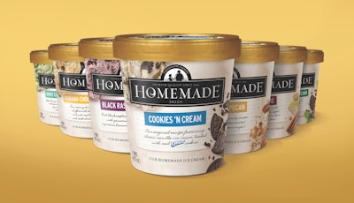
After an extensive and strategic visual audit, Perspective: Branding revamped the Homemade Brand line starting with a new distinctive brand identity: the image of a father and son gazing out to the future sitting atop the brand name.
“We are paying homage to the wholesome values and family history, the passing of the baton from generation to generation,” says Thorneycroft.
He then chose a white contemporary font with a twirl in the letter ‘o’ on a solid black rectangle representing the creaminess and the act of mixing in all of the quality ingredients.
Photography of a large ice cream scoop and natural ingredients used to make the product cues the high-quality ingredients that go into the creation of the ice cream and its taste appeal. A white marble background evokes a modern kitchen countertop, or a slab where the ice cream is cut, to check for quality and consistency. Each flavor is written on a recipe card to highlight the homemade ingredients and allude to the traditional passing down of recipes. Finally, the lid color was changed from a generic black to a premium gold reflecting both the quality and a cue to dairy.
The new Homemade Brand packaging and new innovative flavors are currently being shipped to its almost 200 UDF retail stores as well as Kroger, Meijer, Walmart, Fresh Market, and other independent supermarkets. In addition, a TV ad created by Perspective: Branding and Match Marketing Group have already begun airing in local markets.