For years, Cutex has been a household name in nail care, but lookalike packaging by competitive branded and private-label products was beginning to confuse consumers and cause lost market share for Cutex. In a Cutex Brands survey, eight out of 10 respondents claimed they were buying Cutex products, even though sales share showed that was not possible.
Shortly after the company changed hands in 2010—from Prestige Brands Holdings to the formation of Cutex Brands—the new management set out to restore the brand to premium status. First, it developed Advanced Revival, the first new nail-polish remover formula in 15 years by combining an acetone-based formula with natural botanical nourishing oils that solidify after application to produce stronger, healthier nails.
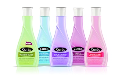
Second, they turned to Berlin Packaging’s Studio One Eleven design division to update, rebrand, and differentiate the package. While retaining the basic bottle silhouette to make the container instantly recognizable as nail polish remover, the design team made critical changes to jettison the brand’s commodity look. Among the structural changes, Studo One Eleven increased the height of the high-density polyethylene bottle to provide more visibility on shelf. Replacing a standard, straight lined cap, a reverse-tapered closure was selected that elongates the bottle and accentuates its upscale appearance
Adding femininity and a premium image to the bottle, a decorative, swan-like shape was debossed on its front panel. The front label was then die-cut in the same swan shape and updated with a modernized logo, softer graphics, and a lighter pastel-color palette.
The new package was launched in April in 6- and 10-oz sizes, in five SKUs.