There are many images like the duck-rabbit, or more recently “the dress,” that shed light on the way people can look at the same image and come away with different perceptions. So how can companies design labels appropriately if people can interpret the same visual so differently? How can designers illicit the same interaction with a medical product across a diverse set of users?
Quantifying the ‘X’
Dr. Laura Bix is a professor and associate director at the School of Packaging at Michigan State University (MSU) and a respected innovator in package design. She is passionate about improving health through packaging. At HealthPack 2017, she explained that an important part of her mission is quantifying the “X” between people and packaging, including medical errors, adverse events, mistakes in the operating room, and hospital-acquired infections. “My primary job is to develop new knowledge. But I have to do it purposely,” she said.
In this evolving landscape (see Sidebar, below), Dr. Bix and her team study the physical, perceptual and cognitive interface between people and package design.
Labeling issues
In Monica Cai’s thesis during her time at Michigan State University, she delved into issues experienced by perioperative personnel, holding seven focus groups to identify problems and opportunities within medical device packaging. In reports of problems, the top three types were:
-
Aseptic presentation (41.4%)
-
Opening (31.0%)
-
Labeling (19.0%)
Two broad themes emerged related to labeling issues:
-
The personnel stated they preferred not to read, and that they liked transparent packaging to allow quick identification of contents. Some really liked color coding, while some said the lack of standards for such coding caused errors because people don’t read the labels.
-
Critical information must be quickly identified and readable. For some, non-critical information interfered with what they needed to know: critical features such as a product’s expiration date and identification and whether the item was sterile or contained latex. Further, the absence of information regarding latex status caused confusion. Specifically, providers reported uncertainty about whether a product with no information would be safe to use for latex-allergic patients; exposure to latex among those who are allergic can potentially be life-threatening.
Out of the box
Do Chan Seo’s dissertation work examined how information formatting affected people’s attention to the critical information identified by Ms. Cai. Participants viewed two labels on a screen that were identical with regard to graphics, but displayed differing information (such as one having latex and one being latex-free). Users were asked to choose the latex-containing product as quickly as possible.

Dr. Seo calculated the proportion of correct answers and the time to correct result. What he found was that color coding, using symbols and grouping critical pieces of information provided a statistically significant advantage. However, when critical information was boxed, participants were more likely to choose incorrectly. Dr. Bix noted that the hypothesis is that the graphic element is not imbedded in the information itself, and so it is actually distracting the viewer, where the color and symbol are actually imbedded in the message. It was not a finding that the team expected.
After the“optimal” aspects—color coding, critical information grouped with symbols— were identified, researchers examined the trials where the optimized conditions were present, and compared those trials to the trials from two labels based on those commercially available at the time of the test. The optimal labels offered statistically better results in terms of both correct choice (approximately 97% vs. 92% and 90%) and time to correct selection (around 3.8 seconds vs. 8.9 and 8.3) when compared with the two that were based on commercial designs. In an emergency, every second counts.
Though the accuracy boost may not seem important, Dr. Bix reminded, “Think of that if you’re latex-allergic on the table.” Any increase in accuracy when it comes to identifying product features could have a huge impact on health outcomes.
Current obstacles
Even as healthcare practitioners cite a lack of standardization in labeling, the solution remains a challenge. Other than what labeling inputs are required by law, Eric Estrada, an MSU master’s program student, pointed out that much of device label content and formatting is up to manufacturer discretion, leading to a bevy of styles on shelves and confusion on the part of providers.

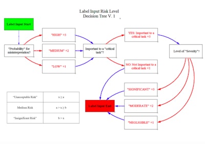
Decision tree
Estrada is currently building an intended user-centered, risk-based tool which will develop label designs for medical device packaging. “The user, environment and device all play an integral role. A nurse in the OR is completely different from an EMT in an ambulance,” he said.
He noted that user preference and user needs are not always congruent. The ultimate goal of the labeling is to reduce patient risk, defined by the severity associated with a misinterpretation times the probability of its occurrence.
Most studies are limited in that they focus on label optimization of a single device. Estrada’s approach is to:
-
Design a universal decision hierarchy that can be used over a wide range of devices.
-
Determine the basis of what causes patient risk. What inputs are important and how should they be classified?
-
Information formatting is determined by risk level.
The process has three basic parts:
-
Labeling input decision tree: What is required by law based on 21 CFR Part 801, 830, 1010, etc.? “There are some extra variables that could be added based on manufacturer, and international guidelines,” noted Estrada.
-
Risk level decision tree: Categorize information by risk to patient based on ISO 14971, FDA guidance on human factors, and ANSI/AAMI human factors engineering standards. In this tree, the user begins with the label input requirements from the first step, and asks about the probability for misinterpretation, whether it’s important to a critical task that could harm the patient if performed incorrectly and the level of severity. The idea is to tally up a score and categorize information by risk level.
-
Formatting and text style table (currently in development): Estrada plans to construct formatting standards—based on previous research to create labels and then objectively evaluate their performance against existing labels empirically and objectively.


Many companies have donated labels which Eric is using in the study.
“These donated labels are assisting us in determining gaps and a tool to objectively create labels from a user-centered, risk-based perspective. Ultimately, we’re focused on patient-centered outcomes, and I want to mold the whole picture together,” he said. “Harmonizing labeling is not an easy task. There are multiple variables and entities working on this; we are grateful for our partners, their feedback and the donation of real product labels. These partnerships enable us to do things that are not only experimentally rigorous, but also ecologically valid, and, ultimately, hopefully in the best interest of the patient.”
Sidebar: Evolving from the Perfect Wrapper
Dr. Bix spoke about “a perfect wrapper,” which was defined as one that is impervious to extraneous microbes, liquid-proof, free of holes, free of lint, free of memory, strong enough to resist punctures and tears and economical to use.
But nothing about that definition addresses the patient or their health. “That's what we had to take care of at the beginning. But now we can be a big player at the table. We’re evolving and changing and ready to make an impact,” she said.
Healthcare, she noted, is evolving as well, from siloed systems to one that puts the patient at the center of things. The industry is on the cusp of personalized treatments. There are changes in reimbursement models, based more and more on health outcomes. The attitude is shifting from “how low can the per-unit price go?” to the overall cost perspective. “If more expensive packaging means two less hospital days, then that’s better. We’re starting to require hospitals to be responsible for hospital-acquired infections.”
Patient compliance, now seen as almost “draconian,” has given way to patient adherence: Has the patient complied with the mutually agreed-upon treatment?