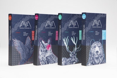
With a friendly and approachable, yet refined, look, Sonoma Cannabis Company has launched a line of cannabis concentrates—or nectars, as it has branded them—in packaging reflecting its roots in the “Valley of the Sun” and the high quality of its 100% pesticide- and chemical-free product. In February 2016, the company introduced four varieties of nectar for use with vaporizer pens under the name AYA, a word with a number of cross-cultural translations, including “beauty,” “angel,” and “soul.”
AYA was created originally for the medical marijuana market, but with an eye toward the then-imminent legalization of recreational cannabis in California, and is geared toward the discerning customer. The product is sustainably grown in California’s Sonoma Valley. Says the Sonoma Cannabis Company, “AYA is grown using just four ingredients: Earth, Water, Sun and Sky, with no, absolutely no pesticides or chemicals. It’s then carefully crafted using our proprietary low-temperature extraction process, batch-tested to ensure unmatched quality,and finally hand-finished to create concentrates that deliver a consistently enjoyable, rewarding experience.”
In summer 2015, the company approached John McNeil Studio to establish a brand and product identity for their line of vape pens. As Gerald Lewis, Group Creative Director of John McNeil Studio, explains, the project expanded to include a full-scale brand positioning, identity, and go-to-market strategy for the flagship product as well as a roadmap for the future of the company.
From the beginning, the strategy was to create a brand identity and product packaging that would showcase the premium quality and welcoming attitude of the Sonoma Cannabis Company brand. As Lewis explains, there were several other goals as well: “Because both the company and the products have deep roots in Northern California culture, we wanted to honor that through packaging designs. Most importantly, we wanted to bring cannabis use out from the shadows, and create packaging that people would proudly display in their homes.” Making sure the packaging displayed well in the dispensary was also a priority.
There are two types of packaging structures—both paper-based cartons. The first, for the pen and cartridge, is “a substantially-sized box,” says Lewis, that opens like a book to reveal the story of the AYA product and the Sonoma Cannabis Company parent brand. For individual cannabis nectar cartridges, Lewis says the studio found a way to continue that visual theme on a much smaller surface area.
The AYA name was conceived by JMS. Says Lewis, “We wanted to reflect the simple, unadulterated nature of the product with the logo and typography.” JMS also gave each blend its own name—Inspire, Awaken, Relax, and Slumber—to give consumers, especially first-time users of marijuana, an understanding of how the individual strains might affect them. Packaging for each variety is illustrated with a different animal native to Northern California, pictured against what appears to be a starry night-sky background. “The animals round out the brand story and give it a sense of place,” says Lewis.
Cartons are offset-printed in five spot colors, plus black with a satin aqueous coating on Neenah Folding Board. Print production is by Sprinkel Media Network.
Since being introduced to in February 2016, Lewis says the products have been so popular that dispensaries often run out of product before regularly-scheduled stocking. “Consumers love the animal illustrations, and we’ve heard that many are in the habit of collecting the individual product packages that represent the different cannabis blends,” he says.
AYA products are now selling in 40 dispensaries throughout California.
