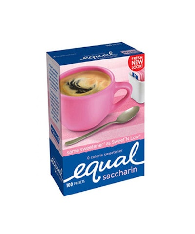
Equal, a zero-calorie sweetener, recently unveiled a fresh new look that’s reflected in its logo, packaging, and Web site.
The new brand logo displays a flowing lower-case script set against the signature “Equal blue” background. The bold new packaging allows consumers to more easily identify the various Equal product boxes by color and type of sweetener. While all three offerings are grounded in a dark blue backdrop, each features a vibrant burst of distinguishing color—including Equal Original (blue), Equal Saccharin (pink), and Equal Sucralose (yellow).
The classic white coffee cup has been replaced with a colored mug that matches the type of sweetener and underscores the brand’s primary usage. In addition to coffee and tea, Equal tastes great with iced tea, lemonade, sprinkled on cereal and fruit and in most recipes that require sugar.
The new packaging also extends to the Equal Spoonful 4-oz container, which features images of fresh, mouth-watering berries.
“After more than 20 years with the same logo, it was time for an updated and modern look,” says Cheryl Gill, director, North America Marketing for Chicago-based Merisant US, Inc., Equal’s manufacturer. “The new logo is familiar yet contemporary and conveys indulgent sweet gratification and the brand’s zero-calorie promise.”