WW, the new Weight Watchers, strives to be an inclusive wellness brand. While Weight Watchers has been an established icon for decades, the WW team, along with SY Partners, sought to bring the transformation to life to extend the appeal to new consumers while continuing to resonate with the existing community.
Pearlfisher New York led the eight-month global packaging redesign for WW as part of a global inter-agency team, focusing on the values and mission of the new brand. “Healthy food is colorful, not bland. Food is part of a rich, energetic, vibrant and deeply satisfying life – and the WW brand needed to make you feel the same way,” says Pearlfisher Strategy Director, Lauren Koprowski. “Crucially, the visual messaging needed to truly inspire people, not be preachy. This led to the big idea and new visual positioning; ‘Full of life’ – cementing WW as full of flavor, full of real ingredients, full of support.”
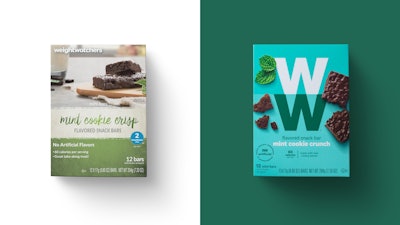
The design transitioned from the previous white packaging to a diverse set of tones, reflecting “the vibrancy and diversity of the WW community,” explains Christian Bird, Associate Creative Director at Pearlfisher. “Through its unexpected color palette, proud WW brand mark and photography of real food, it makes a bold declaration at shelf. We’re excited about this dynamic, intuitive and easy-to-shop design system.”
A key part of the redesign is food photography that focuses on the actual ingredients, calling out that products are free of artificial sweeteners, preservatives and color, complete with crumbs for an added dose of reality.
To keep the focus on the food, the brand’s SmartPoints, a proprietary point value system, have been shifted from the front-of-pack placement. Cindy Sada, Senior Director, Consumer Products at WW says, “Pearlfisher has been an outstanding creative and strategic partner to WW. They understand our mission as a global, purpose-driven brand, and we’ve been inspired by how they brought our brand to life via compelling packaging design across our full range of consumer products.”
The newly designed WW consumer products are available in WW Studios and WW e-commerce channels in most markets, with the design rolling out throughout 2019 at third-party retail channels globally.