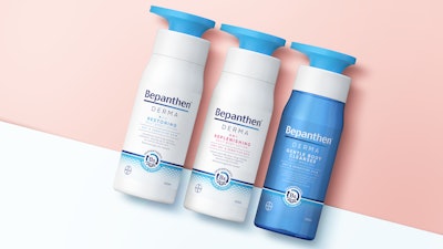
Recently, Bayer launched a new range, Bepanthen Derma, for the daily management of dry skin. The global life sciences company tapped creative agency Free The Birds for new branding, 2D and 3D packaging designs, typography, illustration, tone of voice and photography.

The agency previously worked on the entire Bepanthen design portfolio for wounded skin, baby skincare, and medicated skincare ranges. One of the goals behind the new Derma refresh was to build on the brand’s 75-year heritage and consumer trust, while shifting away from clinical or medical perceptions in favor of cosmetics visual cues.
The company explains, “To achieve this, Free The Birds has translated the science of Bepanthen’s mode-of-action into a new graphic depicting the skin’s surface and cells layered over a gentle gradient in the brand’s core colors of blue and white, communicating a sense of action, efficacy, and skin barrier repair. This graphic expression is used consistently both on and off-pack to communicate the product’s effectiveness to consumers in a simple and approachable way that stands out from other competitors in the daily-use cosmetics space.
- The graphic is paired on-pack with a ‘B5 icon’ to signpost Bepanthen’s signature ingredient and the trusted efficacy that Bepanthen brings to daily skin management.
- Typography has been designed to facilitate clear and direct messaging of the product’s benefits in the brand's new encouraging, empathetic and assuring tone of voice, giving it more personality that moves it on from its clinical origins. Meanwhile, a confident new logo lock-up conveys a sense of trust, heritage and expertise, with the inclusion of the blue gradient in the underline providing another nod to the healing process."
 | Read this story on Colgate's recyclable, clear PET toothpaste bottle. |

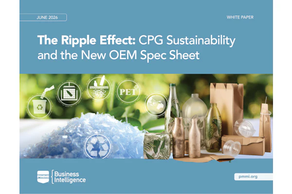
For the design of the new 3D pump structures for Bepanthen Derma’s wash and cream products, the agency collaborated with product design consultancy PENSA.
Chris Padain, VP head of design & packaging at Bayer commented, “We are very excited about launching the new Bepanthen Derma branding and bringing the products to a wider audience of consumers seeking a proven solution for the daily management of dry skin. Free The Birds have been excellent partners to work with throughout this process and we are delighted with how they have evolved the brand whilst maintaining a strong connection to the heritage and scientific efficacy that we are so proud of."

PACK EXPO Las Vegas and Healthcare Packaging EXPO (Sept. 27-29, Las Vegas Convention Center) will reunite the packaging and processing community. With over 1400 exhibitors, no other event in 2021 will bring together a more comprehensive gathering of suppliers offering new products, technologies, and solutions. Attendee registration is now open.