Feminine care brand Rael is a startup founded in 2017 by three Korean American women who wanted to bring wellbeing to women’s lifestyles, offering products free of harsh chemicals. “Because we grew up in Korea, we grew up using Korean feminine care products, which we found are higher performing and more comfortable,” says CEO Yanghee Paik.
The women all came from various work backgrounds and learned about the personal care market as they went. “I used to be a movie distributor at the Walt Disney Studios,” explains Paik. One cofounder is a designer and the third, a best-selling writer on empowerment and female leadership.
Rael co-founder and CEO Yanghee Paik
Beginning with feminine pads and liners—which Paik says are more popular in Korea—they were focused on using high quality ingredients, opting for organic cotton from Texas. “In this space, it's a big advantage that we are female-founded and that we knew exactly what we wanted as consumers ourselves. That really helped a lot to get the product right,” she notes.
Their first product line was successful. Three to four months after launching on Amazon, they became the number one brand in the segment. They knew the tampon market was big in the U.S. and branched out. “After getting some strong VC backing, we launched our B2C sites and then our big mission was to secure a brick and mortar distribution channel” to catch consumers passing by and make it easy for them to repurchase.
Rael secured a deal and began selling in Target stores in 2019. In addition to pads and tampons, they began producing hygienic wipes, heating pads, and skincare.
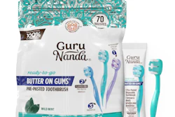
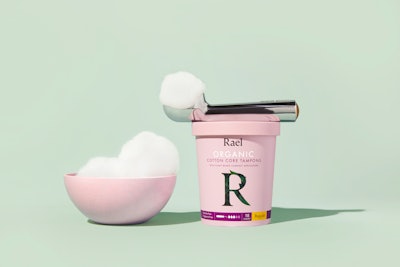
With two tampon SKUs on the market—a long applicator and a cardboard applicator both in traditional cartons—Rael wanted fresh packaging for their new compact tampons.
Whimsical look
“With this third launch in the tampon family, we wanted to do something very unique. You think about who is using this compact tampon. It’s a smaller package for people who are more active, who live a dynamic life, and are maybe more adventurous,” Paik says. “So we wanted to do something that's a little more fun for these consumers.
The team searched for a lid that’s tight enough so it doesn't get loose—they are able to apply two smaller adhesive stickers on the sides instead of applying tape all the way around.
“Tampons and pads don't have to be ugly—they can be elegant and sophisticated. If you do something that's curvier, that really stands out. This ice cream pint caught our eyes. We wanted something playful and whimsical that would look pretty on the shelf,” she notes. “And I don't think people would be embarrassed to keep this outside of their cabinets and put it on the counter.”
They are not able to reveal the carton supplier in China, but Rael designed everything with their creative team in-house.
One challenge they faced was finding the perfect size pint that would hold an 18-count quantity of tampons, because they didn’t want to go the custom carton route. “It took a while to go through a lot of different factories and to find the right size. Once we did, then it was a pretty smooth process,” Paik explains.
The tampons are produced and packaged in Israel, where 18-count cartons are currently packed by hand instead of in an automated process. “That's another challenge, but it's a sacrifice that we made in order to make this package happen. I'm glad that this packaging is catching people's eyes on the shelf… that makes it worth it.”
A quick look at their Instagram shows consumers tagging friends and leaving happy comments about the unique packaging.
Sustainability
Paik says they try to source recyclable and plant-based/paper packaging as much as is possible. (The ice cream carton can be recycled.) For their first iteration, the tampons’ primary packaging is a polypropylene wrap. By the next batch, set to hit shelves this summer, they will have transitioned to paper wrappers.
They also had the option to tape all the way around the lid to make it secure. “But instead, we looked hard to find a lid that’s tight enough so it doesn't get loose. Then we use two small adhesives on the left and right side of the lid so that when people peel them, they don't have to damage the whole carton,” Paik says. She wanted it to look good on the counter for possible reuse. “That’s something that we're keen on, making things that aren’t meant to be wasted right away, but that can be viewed as reusable if possible.”
Marketing to match
In keeping with the whimsical packaging design, their site and Instagram feature cotton ball ice cream images that are playful without appearing childish (see cover image). “If you think about periods, there's nothing really fun about them. Many consumers happen to eat a lot of sweets during that week—sometimes chocolate and ice cream help. So we linked to the notion of comfort and sweetness during this inconvenient phase of your cycle,” she says.
Their original pad was in green packaging so Paik considers that the main brand color, while the liners come in a slightly orange, natural hue. “We wanted to add this pink color to the family, which gives a feminine, sophisticated look,” she says.
The darker green R in leaves is a graphic element used on every package in the product line. Yellow, green, and orange accents highlight the different absorbencies in the product family.Per her creative director, purple accents offer a regal and elegant feel, and mixing the purple and pink balance optimism, imagination, and trust. The darker green R in leaves is a graphic element used to convey that it’s a natural product and is used on every package in the product line.
The carton messaging starts with “Why Rael?” to list benefits, then moves to the ingredient stories, as well as packaging ingredients. Next is the indication of the absorbency capacity in a concise and visual way. As is required by the FDA, “ATTENTION” goes with the Toxic Shock Syndrome (TSS) warning.
Finding success outside of experience
“It’s been a busy three years for sure,” she says about their expansion to provide hormonal and daily use skincare. They also recently launched reusable pads to grow their sustainable offerings. Paik is inspired that customers are so responsive to the product and conscious of health issues, ingredients, and the environment.
“We're really trying to build Rael as a brand that provides 360-degree solutions to women, everything they need throughout the month with nontoxic, naturally-derived ingredients. That's a big mission for the company.”
She says that while none of the cofounders had firsthand experience or much knowledge about CPGs and feminine care, “the beauty of a startup is that you may not have the background but with the right team, passion, and some out-of-the-box thinking capabilities, you can disrupt the market. I would encourage everyone to think about entrepreneurial opportunities when they come up even if you don’t have the exact experience (though perhaps not during this current pandemic and economic situation).”
Rael founders (from left to right): Aness An, Yanghee Paik, and Binna WonRael
In a time of considerable uncertainty, a constant you can count on is PACK EXPO International and Healthcare Packaging EXPO.
PACK EXPO this November is taking place, either as a live and virtual event combination, or an all-virtual event.
Connecting the industry has never been more crucial as packaging addresses the critical needs of this pandemic, and we will make sure that happens. For over six decades, PACK EXPO has been here to serve and connect the industry, and this year is no exception.
Between virtual FATs, brand evolution, robots, the explosion of e-commerce, remote access to diagnostics and a need to secure the drug chain—there has never been more incentive to participate in PACK EXPO International and Healthcare Packaging EXPO.
This year, we are excited to offer a virtual PACK EXPO experience to complement the on-site event and maximize opportunities for industry connection.
The PACK EXPO virtual experience will maximize opportunities for attendees and exhibitors to achieve business goals by connecting those who prefer not to travel with the people and ideas necessary to drive their business forward during this unprecedented time.
Fresh from the show floor: pharma packaging innovations for 2026
Serialization mandates. Containment demands. Sterile barrier requirements. Our editors found the pharma packaging innovations addressing your biggest challenges at PACK EXPO Las Vegas. Get your free curated report now.
 Rael co-founder and CEO Yanghee Paik
 The team searched for a lid that’s tight enough so it doesn't get loose—they are able to apply two smaller adhesive stickers on the sides instead of applying tape all the way around.