Every quarter, Healthcare Packaging's sister publication, Shelf Impact! and international brand and design consultancy Dragon Rouge USA (www.dragonrouge-usa.com) partner on packaging innovation-related surveys. In a recent survey, a theme emerged that touches on one of the basic tenets of brand building: In order for innovation to be truly successful, a product needs to be easily understood through the eyes of consumers. Telling a consumer-friendly tale that integrates the brand idea, product offering, structure, graphics, and materials ensures clear consumer understanding, product impact, and success at shelf.
For this installment of the survey, consumers were asked to evaluate 15 recent product introductions launched in the personal care and over-the-counter industries through the lens of five distinct criteria:
1. The concept's ability to provoke new ways of thinking about a category.
2. The structure's ability to present new ways of interacting with a product type.
3. The packaging graphics' innovative cues that help bring the product's positioning to life
4. The use of innovative materials.
5. The relative effectiveness of the packaging production process.
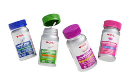
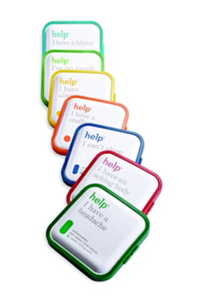
According to survey respondents, the one brand that stood out among the new packages as a fully integrated innovation was Help Remedies (shown here), a minimalist OTC medicine line that focuses on the idea that “Less is more.” Help Remedies' branding weaves a simple message through every aspect of its consumer value proposition—from clear benefit communication to crisp, clean graphics to a single-dose structure.
In contrast, while the feminine care line U by Kotex Limited Edition Designer Series received high scores on graphics, its scores fell when it came to structure and materials. While the brand carried impact, with trend-forward colors and patterns, attention to the rest of the package would have resulted in a more fully integrated solution.
Another package that missed the mark is Theodent, America's first “Chocolate Toothpaste.” Although respondents rated the package as a very interesting concept and structure—with a sophisticated tube whose angular shape and shallow depth afford a sleek yet professional appeal—the brand owner did not link the idea back to efficacious graphics. As a result, consumers misunderstood the benefit of the product.
With this in mind and given the broad spectrum of products in the personal care and OTC industries, here is a break down of this survey's results by category, based on the overall composite scores (1 to 5, with 5 being the highest) of each product, illustrating the ultimate strengths and faults as seen by the consumer.
Don't mess with my hair
We first compared the scores of L'Oreal's Pureology shampoo and conditioner bottles versus the packaging for PERT Plus all-in-one shampoo and conditioner. It is interesting to note that while both brands have recently gone through a redesign, Pureology scored higher in innovation than PERT.
Pureology prides itself on “serious colour care” and effective systems for hair care. They therefore relaunched the line with a unique structure of shampoo (right side up) and conditioner (upside down) to denote a paired system for each benefit. The new metallic graphics clearly delineate the product range as well as showcase efficacy. The relaunch brought the brand a total score 3.42 on our survey, proving that the integration of concept, structure, graphics, and materials, when well thought out, are easily understood by the consumer.
In contrast, PERT Plus came in with a total score of 2.76. Although PERT Plus, launched in 1987, was the first 2-in-1 shampoo/conditioner line, the brand's innovative attributes were not apparent to consumers through its redesign. The brand organizes benefits by color, and features a bold identity on a wavy green bottle. While the new graphics are eye-catching and more contemporary, the core value proposition seems to be absent on graphics, structure, and materials, and was therefore misunderstood by our participants.
The fountain of youth
The second segment examined was anti-aging, through Yves Saint Laurent's new anti-aging line, Forever Youth Liberator, and Frezyderm anti-aging cream, from the Athens, Greece-based pharmaceutical company of the same name. These products approach anti-aging from two different perspectives: pure beauty and pure science.
Yves Saint Laurent is a symbol of luxury and prestige, so when extended into anti-aging, it makes sense that the line would be approached with equal care. The Forever Youth Liberator crèmes and serums are encased in glass packages, providing a distinct, luxurious appeal to consumers looking for youth in a jar. The brand is sleek and mysterious, and borrows cues from the fragrance category. Visually, however, the brand does not communicate the extreme science behind boosting glycan levels in the skin and therefore makes us wonder if there was a missed opportunity to prove efficacy. The product scored a 3.24 on the innovation scale.
In contrast, Frezyderm evokes efficacy and medicinal quality. The core idea of high science is woven into the package's clinical structure and graphics. The packaging shows innovation with a transparent base and the use of a newly patented airless dispensing technology. Although the brand was aligned with the anti-aging clinical benefit and scored a 3.51, there were some consumers who thought the clinical message was pushed too far and perceived the brand to be harmful.
Their lips are sealed
The third segment we delved into was lip care, comparing The Socializer's Can You Keep a Secret? from Elizabeth Grant Skin Care with eos' natural lip balm, which scored a 3.6 and a 3.4 for innovation, respectively.
Elizabeth Grant's Can You Keep a Secret?—part of The Socializer line of personal care products—is a first-of-its-kind lip offering. Truly innovative as a dual-action system of both a lip exfoliator and conditioner, the product stands apart through its unique use of a vibrating exfoliating tip that removes dry skin. In addition, the deep conditioning balm is attached to the vibrating exfoliator with magnetic technology. Users can either keep it attached or pull the lip balm off and take it with them for easy, on-the-go beauty. The overall design received some of the highest ratings overall, but it is clear that there is a lack of understanding and education on the package describing exactly what the product is, how it works, and what its true benefits are.
eos lip balm, which describes itself as a “lip balm that makes you smile,” is a new 95% organic, 100% natural, paraben- and petrolatum-free product packed in an egg-shaped container that comes in a variety of colors based on the individual flavor of the product. Though the packaging and design are highly innovative and new to the lip balm category, on its own, it is difficult to decipher exactly what the product is. (Editor's note: Respondents were shown eos product without its secondary packaging—a blister and card with explanatory information. However, some eos products are sold at retail without secondary materials.)
Balancing act: communication without information overload
The final category examined for this quarter's survey was OTC brands. Kalm's Day herbal stress remedies and Children's AccuDial are two brands that sought to create a product that would revolutionize traditional OTC packaging in a consumer-friendly way. AccuDial's composite score of 3.26 was a bit higher than Kalm's score of 3.10.
With Kalm's Day tablet packaging, Lane's Health looked to deliver a compact design that not only retained product information and a traditional blister pack, but also sought to engage the consumer. The package slides open to reveal the blister pack inside. The structural design received the highest score in this category, as consumers were enthusiastic about an OTC medicine designed for an on-the-go lifestyle. Yet, despite the positive feedback, consumers thought that the innovation was “nothing new” and that the packaging could be more interactive.
In a similar light, AccuDial's new line of children's liquid OTC cold medicine describes itself as a “revolution in over-the counter dosing.” This “revolution” is a two-part label that can be twisted to effectively produce an exact dose of medicine based on a child's weight. While this dosing system is extremely innovative and interesting, with high scores in both innovation and concept, the consumer believes the package is cluttered. When a package over communicates, its functionality and purpose can be lost in translation.
So what can we learn from our journey through innovative packaging within the beauty care and OTC categories? As companies introduce new products into the beauty and OTC aisles, we urge them to take a step back and look through the consumer's eyes. Although a color or a structure might be innovative on its own, if you integrate the brand, concept, structure, and graphics to tell a full and understandable story, your innovation will enjoy better success. Get in touch with your inner storyteller and go forth!
--By Eric Zeitoun, Dragon Rouge USA
For this installment of the survey, consumers were asked to evaluate 15 recent product introductions launched in the personal care and over-the-counter industries through the lens of five distinct criteria:
1. The concept's ability to provoke new ways of thinking about a category.
2. The structure's ability to present new ways of interacting with a product type.
3. The packaging graphics' innovative cues that help bring the product's positioning to life
4. The use of innovative materials.
5. The relative effectiveness of the packaging production process.
According to survey respondents, the one brand that stood out among the new packages as a fully integrated innovation was Help Remedies (shown here), a minimalist OTC medicine line that focuses on the idea that “Less is more.” Help Remedies' branding weaves a simple message through every aspect of its consumer value proposition—from clear benefit communication to crisp, clean graphics to a single-dose structure.
In contrast, while the feminine care line U by Kotex Limited Edition Designer Series received high scores on graphics, its scores fell when it came to structure and materials. While the brand carried impact, with trend-forward colors and patterns, attention to the rest of the package would have resulted in a more fully integrated solution.
Another package that missed the mark is Theodent, America's first “Chocolate Toothpaste.” Although respondents rated the package as a very interesting concept and structure—with a sophisticated tube whose angular shape and shallow depth afford a sleek yet professional appeal—the brand owner did not link the idea back to efficacious graphics. As a result, consumers misunderstood the benefit of the product.
With this in mind and given the broad spectrum of products in the personal care and OTC industries, here is a break down of this survey's results by category, based on the overall composite scores (1 to 5, with 5 being the highest) of each product, illustrating the ultimate strengths and faults as seen by the consumer.
Don't mess with my hair
We first compared the scores of L'Oreal's Pureology shampoo and conditioner bottles versus the packaging for PERT Plus all-in-one shampoo and conditioner. It is interesting to note that while both brands have recently gone through a redesign, Pureology scored higher in innovation than PERT.
Pureology prides itself on “serious colour care” and effective systems for hair care. They therefore relaunched the line with a unique structure of shampoo (right side up) and conditioner (upside down) to denote a paired system for each benefit. The new metallic graphics clearly delineate the product range as well as showcase efficacy. The relaunch brought the brand a total score 3.42 on our survey, proving that the integration of concept, structure, graphics, and materials, when well thought out, are easily understood by the consumer.
In contrast, PERT Plus came in with a total score of 2.76. Although PERT Plus, launched in 1987, was the first 2-in-1 shampoo/conditioner line, the brand's innovative attributes were not apparent to consumers through its redesign. The brand organizes benefits by color, and features a bold identity on a wavy green bottle. While the new graphics are eye-catching and more contemporary, the core value proposition seems to be absent on graphics, structure, and materials, and was therefore misunderstood by our participants.
The fountain of youth
The second segment examined was anti-aging, through Yves Saint Laurent's new anti-aging line, Forever Youth Liberator, and Frezyderm anti-aging cream, from the Athens, Greece-based pharmaceutical company of the same name. These products approach anti-aging from two different perspectives: pure beauty and pure science.
Yves Saint Laurent is a symbol of luxury and prestige, so when extended into anti-aging, it makes sense that the line would be approached with equal care. The Forever Youth Liberator crèmes and serums are encased in glass packages, providing a distinct, luxurious appeal to consumers looking for youth in a jar. The brand is sleek and mysterious, and borrows cues from the fragrance category. Visually, however, the brand does not communicate the extreme science behind boosting glycan levels in the skin and therefore makes us wonder if there was a missed opportunity to prove efficacy. The product scored a 3.24 on the innovation scale.
In contrast, Frezyderm evokes efficacy and medicinal quality. The core idea of high science is woven into the package's clinical structure and graphics. The packaging shows innovation with a transparent base and the use of a newly patented airless dispensing technology. Although the brand was aligned with the anti-aging clinical benefit and scored a 3.51, there were some consumers who thought the clinical message was pushed too far and perceived the brand to be harmful.
Their lips are sealed
The third segment we delved into was lip care, comparing The Socializer's Can You Keep a Secret? from Elizabeth Grant Skin Care with eos' natural lip balm, which scored a 3.6 and a 3.4 for innovation, respectively.
Elizabeth Grant's Can You Keep a Secret?—part of The Socializer line of personal care products—is a first-of-its-kind lip offering. Truly innovative as a dual-action system of both a lip exfoliator and conditioner, the product stands apart through its unique use of a vibrating exfoliating tip that removes dry skin. In addition, the deep conditioning balm is attached to the vibrating exfoliator with magnetic technology. Users can either keep it attached or pull the lip balm off and take it with them for easy, on-the-go beauty. The overall design received some of the highest ratings overall, but it is clear that there is a lack of understanding and education on the package describing exactly what the product is, how it works, and what its true benefits are.
eos lip balm, which describes itself as a “lip balm that makes you smile,” is a new 95% organic, 100% natural, paraben- and petrolatum-free product packed in an egg-shaped container that comes in a variety of colors based on the individual flavor of the product. Though the packaging and design are highly innovative and new to the lip balm category, on its own, it is difficult to decipher exactly what the product is. (Editor's note: Respondents were shown eos product without its secondary packaging—a blister and card with explanatory information. However, some eos products are sold at retail without secondary materials.)
Balancing act: communication without information overload
The final category examined for this quarter's survey was OTC brands. Kalm's Day herbal stress remedies and Children's AccuDial are two brands that sought to create a product that would revolutionize traditional OTC packaging in a consumer-friendly way. AccuDial's composite score of 3.26 was a bit higher than Kalm's score of 3.10.
With Kalm's Day tablet packaging, Lane's Health looked to deliver a compact design that not only retained product information and a traditional blister pack, but also sought to engage the consumer. The package slides open to reveal the blister pack inside. The structural design received the highest score in this category, as consumers were enthusiastic about an OTC medicine designed for an on-the-go lifestyle. Yet, despite the positive feedback, consumers thought that the innovation was “nothing new” and that the packaging could be more interactive.
In a similar light, AccuDial's new line of children's liquid OTC cold medicine describes itself as a “revolution in over-the counter dosing.” This “revolution” is a two-part label that can be twisted to effectively produce an exact dose of medicine based on a child's weight. While this dosing system is extremely innovative and interesting, with high scores in both innovation and concept, the consumer believes the package is cluttered. When a package over communicates, its functionality and purpose can be lost in translation.
So what can we learn from our journey through innovative packaging within the beauty care and OTC categories? As companies introduce new products into the beauty and OTC aisles, we urge them to take a step back and look through the consumer's eyes. Although a color or a structure might be innovative on its own, if you integrate the brand, concept, structure, and graphics to tell a full and understandable story, your innovation will enjoy better success. Get in touch with your inner storyteller and go forth!
--By Eric Zeitoun, Dragon Rouge USA
Companies in this press-release