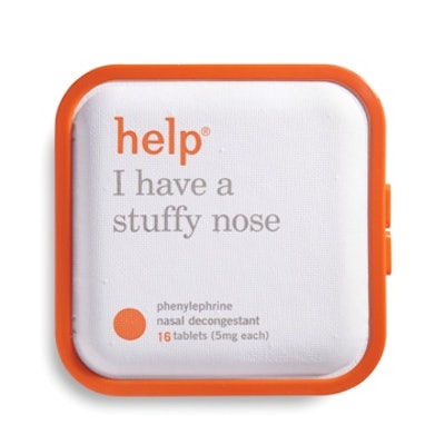
Help Remedies, a New York-based creator of minimalist over-the-counter medicine, is communicating the message that less--less drugs, less dyes, less coatings--is sometimes more. The company's statement, "Take Less," calls out "big pharma" for its excesses and promotes the idea of moderation in OTC drugs.
To be sure, a company press release notes, "Help isn't an anti-drug company; in fact they are a drug company, one that understands and values the importance of medicine, yet thinks that simplicity and moderation are desperately needed in the industry."
Founded in 2008 by former advertising executives Richard Fine and Nathan Frank, Help began as a response to personal distrust and confusion with OTC products, packaging, and language. The brand quickly amassed a cult following for its sleek, eco-friendly packaging, product monikers, and online wit.
The packaging is not only visually pleasing, but one touch offers a sensory delight as well. "Texture is an important aspect of Help's approach to packaging," says Kimberly Oliver, the company's consulting communications director. "Instead of the hard plastic prevalent in the OTC drug category, Help's paper pulp clamshell is soft, tactile, and non-threatening. The rounded edges also contribute to the inviting nature of the packaging. Help is meant to be comforting, with textures that people instinctively reach for when they aren't feeling well."
Although the company prefers not to reveal the supplier of the material, Oliver does say it incorporates Plastarch, or PSM, a biodegradable thermoplastic resin she describes as "corn-based starch combined with several other biodegradable materials and modified in order to obtain heat-resistant properties." She adds, "Our plastic is a blend of PSM and polypropylene."
For this third iteration of Help's packaging, the company employed Pearlfisher to "redesign the exterior graphics, make the logo and product names bolder, and enhance legibility and on-shelf presence," says Oliver.
She says this version of the packaging eliminates SKU-specific tooling and makes inventory management simpler. "We wanted to retire the previous iterations' debossed product outlines, and we asked Pearlfisher to come up with another solution. They suggested the colored product silhouette printed on the surface of the clamshell, which is a nice carryover from the past and reduces cost.
"While Pearlfisher was working on the graphics, Dale Trigger, our in-house engineer, reengineered the plastic border to reduce material and make the latch more intuitive to use."
Providing some packaging background, Oliver notes, "Between the first iteration and the second there were many changes. The first design encompassed only two products and was sold almost exclusively through boutique retailers. As we moved into more typical OTC drug retailers and expanded the product line, we had to make changes. To enhance ease of display, the package size was reduced to save space on shelves, and the packaging was designed to be able to stand up. The colored border was added to add impact on shelf and to differentiate each product within the range.
"With the second iteration we developed a packaging system that can grow with our company as we continue to introduce new products."
After its initial launch, Help discovered some problems bigger than packaging. "Drug companies' ongoing need to make more and sell more results in a proliferation of complicated and unclear products--mixed active ingredients, higher dosages, unnecessary dyes and coatings. All of this nonsense makes for a confused consumer, who very often has little idea what drugs they are actually consuming when they reach for a bottle of pain medicine," says Help co-founder and CEO Richard Fine.
OTC confusion and overdose is a concern among pharmacists, says the company. Help's medical director, Doctor of Pharmacy (Pharm.D.), David Pompei, says, "Some people think that by adding more warnings to the label you solve the problem of confusion in the drug aisle. But the truth is, the longer the label, the less likely people are to read it."
The "Take Less" message and Help's seven OTC products debuted in October in Walgreens stores nationwide. The company's current retail distribution includes Duane Reade, Pharmaca, select Target stores, and boutique hotels. Based on the company's efforts to use packaging in its marketing strategy, don't be surprised to see further changes in 2012.
