For instance, this month Thomas Pharmaceuticals, New York, is introducing a new antacid called Acid+All in a tin reminiscent of those used to package mints or hard candy. The company's aim: To evoke the days when apothecary products were packaged with panache. The package should breathe new life into what might be considered a worn-out category: OTC antacids. A vertical paperboard dispenser displays and gravity-feeds the tins. Packaging suppliers and specifications were not divulged.
Another new product, Omnibalm, sold in retail drugstores, is packaged in a sleek-shaped bottle befitting of high-end cosmetics. The bottle stands on its cap and is molded with a flat surface area to accommodate the label. Lydia Carson, president and CEO of Balm Innovations, Little Rock, AR, turned to New Creature to design the label and the paperboard point-of-purchase display for the cream, which is used to treat a variety of skin conditions. The cream was developed by a research pharmacist, Bill Gurley, but the packaging looks anything but medicinal.
Similar products are typically packaged in tubes and tend to use blues and greens, but Carson wanted to stay away from the pharmacy look. The company chose warm colors, such as red and gold.
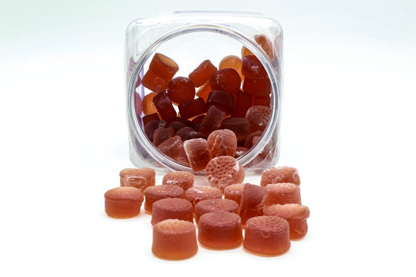
Taking the pharmacy out of the package might be just what is needed to differentiate your product on the shelf and make it more appealing to consumers.
--By Kassandra Kania
Kassandra Kania is a freelance writer based in Charlotte, NC. She has covered healthcare packaging for several years, most recently as a trade publication editor.
Another new product, Omnibalm, sold in retail drugstores, is packaged in a sleek-shaped bottle befitting of high-end cosmetics. The bottle stands on its cap and is molded with a flat surface area to accommodate the label. Lydia Carson, president and CEO of Balm Innovations, Little Rock, AR, turned to New Creature to design the label and the paperboard point-of-purchase display for the cream, which is used to treat a variety of skin conditions. The cream was developed by a research pharmacist, Bill Gurley, but the packaging looks anything but medicinal.
Similar products are typically packaged in tubes and tend to use blues and greens, but Carson wanted to stay away from the pharmacy look. The company chose warm colors, such as red and gold.
Taking the pharmacy out of the package might be just what is needed to differentiate your product on the shelf and make it more appealing to consumers.
--By Kassandra Kania
Kassandra Kania is a freelance writer based in Charlotte, NC. She has covered healthcare packaging for several years, most recently as a trade publication editor.