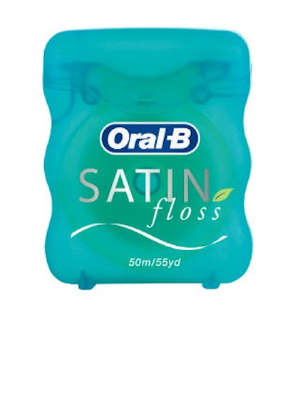
Flossing is an important step as part of an oral-hygiene ritual, but many consumers resist it. P&G identified an opportunity to make flossing more experimental.
Working with Phillips Design Group, P&G engages floss shoppers with a design that holistically evokes water to signal attributes such as “clean” and “refreshing.” The container's ergonomic shape fits snugly in fingers, and both the wave on the clear label and the translucent package mimic light dancing off water.
Besides a blue, iridescent tint, the plastic container has a satin-like feel to the touch. This surface is created when silver and gold metallic flecks, and iridescent particles, are mixed into the package surface.
Paper and plastic surfaces are naturals for metallic inks, but the consensus view is that marketers interested in working metallics into their design should first confirm that their chosen printer could get good results. Ask to see samples of your printer's previous work involving metallic finishes.
When executed well, as with the Oral-B package, metallic-ink surfaces can help elevate a product beyond the realm of commodity with engaging package textures that feel welcoming in consumers' hands.
--By Jim George, Editor, ShelfImpact!
Editor's Note: This article is an excerpt from the Summer 2009 issue of ShelfImpact! Read the entire story. http://www.shelfimpact.com/archives/2009/06/touch_elevates_its_game_as_a_p.php