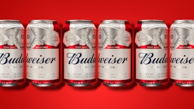
In fall 2015, AB-InBev launched a new global package design for Budweiser that the company says reflects the beer’s “bold, confident stance and macro pride.” A project begun in 2013, the refresh is the thirteenth redesign in the brand’s history but only the first time all of Budweiser’s packaging has been the same worldwide.
“Budweiser strives to be a leader in design and packaging innovation, and 2015 was a pivotal year for us as we focused on reconnecting with a new generation of beer drinkers,” says Budweiser Vice President Ricardo Marques. “Before the redesign, we realized there was a disconnect between brand imagery on our bottles, cans, and secondary packaging. The bottle was focused on the iconic Budweiser label, whereas the can and secondary box designs focused on the bowtie.”
To bring consistency to the brand with a new package design that projected the care and detail Budweiser puts into brewing its lager—one of the more difficult styles of beer to brew well, according to Marques—the company worked with global design agency Jones Knowles Ritchie.
To tap into the heritage of the brand, which was born in 1876, Budweiser and JKR “sifted through mounds of decades-old memorabilia to refresh the label with an uncluttered, fresh look that is ‘authentically Budweiser,’” explains Marques.
They then took six different designs and put them through two rounds of rigorous testing in four cities in each of the six different countries where Budweiser is sold. These designs were then tested against the relevant competition in each market as well as against the previous packaging.
Says Marques, “The information gleaned from the studies was invaluable. We learned which finishes and design elements resonated most, and which were less important from a consumer standpoint. These responses ultimately guided the revised design process.”
While nothing historical is used verbatim in the final package design, the entire label gives a nod to Budweiser’s authentic roots. As Tosh Hall, Creative Director at JKR, explains, each element of the new label was hand-drawn. To spotlight the care Budweiser puts into brewing each batch, JKR enlarged the original Budweiser creed and crest to be more distinct. In addition, the color gold was removed from the design and replaced with platinum to give the label a more elevated look. And, instead of listing “Born On,” the design now lists a “Freshest Before” date, which is approximately 110 days after the beer is brewed.
“Budweiser is an American icon that has been brewed the same way since 1876,” says Marques. “This new packaging is a tribute to our heritage and the legacy of our brewing standards. As a result, we were cognizant to design for the long term to ensure what we do today is still relevant in the coming years.”
The new package graphics have now been rolled out to every country in which Budweiser is sold, with some slight nuances in the design to meet individual market requirements.