Recently, marketers have become more focused on “the first moment of truth” at the shelf—that moment when a consumer picks up a package—and far more aware of the power of packaging to drive sales. However, as consumer packaged goods (CPG) companies have acted more aggressively to leverage design in packaging, we’ve also seen several high-profile mistakes. Two notable examples are Tropicana and Gatorade, in which new packaging systems have led to double-digit sales declines.
This has led some CPG companies to question whether “revolutionary” packaging changes can ever succeed, and to ask if there is a formula for leveraging the power of design, while also minimizing its risks.
With these issues in mind, Perception Research Services recently reviewed our packaging research database of findings across thousands of studies to see what could be revealed in terms of the performance of new design systems vs. current packaging. We also wanted to analyze the primary factors driving “wins” and “losses” at the shelf, and shoppers’ reactions to “revolutionary” packaging changes. The analysis revealed several interesting and perhaps surprising insights to guide packaging strategy.
Can new packaging ever win?
When we studied the performance of new packaging systems, three interesting facts emerged. First, in terms of overall packaging effectiveness (as measured by the PRS Packaging Performance Index, which takes into account measures of shelf presence, appeal, communication and persuasion), we found an almost perfect bell curve: About 50% of new designs outperform a brand’s current packaging, while another 50% represent a step backward in overall performance. This finding belies the often heard claim that “current packaging always wins” in packaging studies. In our experience, this happens only when current and proposed designs are compared side-by-side. When packaging is tested properly—on a monadic basis, simulating the introduction of a new design system—new designs can win. More important, this finding suggests that marketers need not expect initial sales declines when introducing new packaging.
Second, “revolutionary” packaging changes, defined as those that alter two or more primary design elements (packaging structure, branding, color and/or main visuals), follow the same bell curve. However, there is a tilt toward the “top” and “bottom” ends of the spectrum.
In other words, revolutionary changes can work, but they are higher-risk and higher-return propositions. Dramatic changes are more likely than incremental changes to drive significant improvements or declines in packaging performance.
Of course, this finding is quite intuitive, so the real learning comes at the level of packaging elements.
Finally, the research confirmed that true “wins” at the shelf—sales gains driven by a new packaging system—are difficult to achieve. Across studies, we’ve found that about 10% of new packaging systems that were tested drive this result, which is the single most predictive measure of in-market success.
What drives wins at shelf?
A natural next step was to take a closer look at these “success stories” and to identify performance measures and design elements that most highly correlate with their success. This analysis provided a very clear answer: Across brands and categories, increases in shelf visibility were the single strongest driver of sales increases.
This finding is intuitive, yet powerful. Product manufacturers long have known that “unseen is unsold,” but this finding goes a step further. It confirms that if a new design system can drive a higher percentage of shoppers to engage with a brand at shelf, it is highly likely to drive purchase.
In fact, through studies conducted in collaboration with the Wharton School of the University of Pennsylvania and the INSEAD international business school, PRS has found that “re-examination”—getting shoppers to take a second a look at a brand (as measured by PRS Eye-Tracking research)—is an even more powerful predictor of purchase. When shoppers take a second look they actually are reconsidering a brand (giving it a second chance) and bringing it into their consideration set of products as they scan the shelf.
So this leads us one step further, to the question of what drives shelf visibility and leads to a second look. Put simply, the answer is contrast. In other words, visibility is not the result of a shoppers’ conscious decisions (i.e., “I want to check out that brand.”), but instead a physiological process, driven by the contrast between a brand and its competitors on shelf. Thus, the question is what drives contrast, and an analysis reveals three primary drivers: color blocking, unique shapes/structures, and strong brand identity, such as a bold logo or other visual.
In fact, across brands, categories and countries, “revolutionary” new packaging structures have a far higher likelihood of driving sales than changes in packaging graphics. That’s clearly because these new structures have created disruption at the shelf and led more shoppers to “take a look” (or perhaps a second look) at a brand they previously ignored.
How about losses?
Sadly, the analysis also revealed that it is far easier to damage a brand than to grow it. In fact, it’s about twice as likely. About 20% of new packaging systems drove a significant decline in purchases from shelf and 10% produced wins at the shelf.
Interestingly, a closer look finds that declines are neither the inverse nor mirror image of successes, as they are driven by slightly different factors. Rather than shelf visibility, a decline in shop-ability is the factor most consistently linked to lower sales. When shoppers are confused or frustrated at the shelf, they typically react in one of two forms: brand hesitation (“Is this my brand?”) or product findability (“Where is my product?”).
One or both of these factors create enough hesitation for shoppers to revert to a “safer” choice—a competitive brand—and leave their former brand of choice, in some cases permanently.
Which design changes are most likely to create confusion at the shelf? Predictably, changes in brand identity—the logo and/or the primary branding relationship on the packaging—are those most likely to drive brand hesitation. Changes in “versioning” (product names and/or their treatment/placement on pack) are the most likely to drive findability problems. When brands change packaging and product naming simultaneously, they are likely to create hesitation.
Thus, “revolutionary” changes in certain design elements, most notably branding and product naming, are the most likely to drive “losses” and in-market sales disasters.
Implications: ‘A balancing act’
Though the findings from this database analysis were largely intuitive, they remain quite powerful in their implications for design and research. From a design perspective, they point directly to the challenging “balancing act” that must be navigated. To make a difference and drive wins at shelf, designers need to make big changes that create visual differentiation and lead shoppers to reconsider the brand.
Smaller packaging changes, which are less visceral and are not evident when viewed from three feet away within a cluttered shelf set, are very unlikely to impact purchase patterns. However, to avoid major mistakes, designers need to steer clear of brand hesitation and confusion at the shelf, thus ensuring shop-ability.
This analysis speaks to the need to provide some visual continuity to reassure shoppers, and it acts as a counter-balance against the imperative for dramatic change and differentiation.
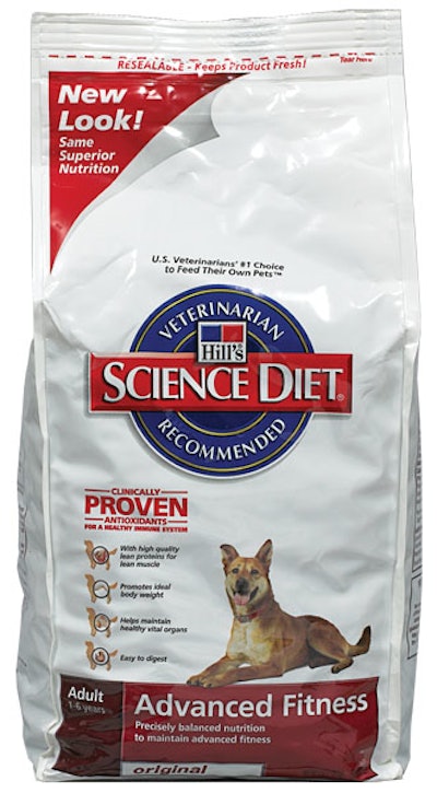
How can designers and marketers navigate this challenge? Here is one compelling strategy. Baked Lay’s, Hill’s Science Diet pet food, and Domino Sugar embody it in successful design changes.
In each of these cases, dramatic and visceral design changes in structure, color, and primary imagery were balanced with continuity in brand identity to provide reassurance and very clear product versioning to facilitate shop-ability.
So, can revolutionary packaging changes work? The overall answer is yes, if they are executed properly—and if care is given in defining the term revolutionary. If being revolutionary involves throwing out all aspects of the past packaging, then changes are very unlikely to be successful. However, if revolutionary is defined as dramatic change to one or two primary packaging elements, and coupled with enough branding and visual continuity to “bring shoppers along,” then revolutionary changes can be effective.
For marketers, the implication is to avoid taking the wrong lesson away from others’ mistakes by resisting revolutionary packaging changes. Instead, the answer is to give designers the power and creative freedom to make a difference at the shelf via new structures, while fighting the temptation to change everything at once. Marketers and designers who navigate this balancing act are far more likely to leverage the power of design and create those elusive wins at the shelf.
Perception Research Services specializes in consumer research to help consumer packaged goods companies connect with shoppers and close sales, conducting more than 700 custom studies annually to guide, assess, and improve packaging and shopper marketing efforts. Contact Scott Young at [email protected].