“Rethink your medicine cabinet with whole food health alternatives.” That’s the advice given by Maty’s Healthy Products, LLC, of Pittsford, NY, a maker of herbal medicines—among them all-natural and organic cough syrups, indigestion relief, and skin-care products—made from whole food ingredients. Until recently, the company was using stock packaging, including bottles and jars, some with secondary cartons, for its range of herbal remedies. But as its business grew, Maty’s decided to invest in new packaging that would more clearly convey its natural ingredients story and differentiate its products on shelf.
Founded nearly 10 years ago, Maty’s is named for the daughter of founders Bob and Carolyn Harrington, who sought out holistic remedies to heal Maty after she was born with serious health problems. Their products can now be found at Walmart, CVS, Rite Aid, and Target and compete with both conventional and natural brands.
In November 2016, Maty’s approached creative agency Haberman to design a fresh new look and packaging for their brand. “From a business standpoint, Maty’s came to us in a time of growing retail distribution,” says Jeff Berg, Creative Director at Haberman. “And, with the public interest in healthier alternatives soaring, they wanted to boost brand awareness, capture market share in the natural remedies space, and appeal to wellness-minded consumers. The new design has everything to do with appealing to those consumers.
“Over-the-counter medicines, as products, have lived in this clean, clinical—even sterile—aesthetic for a long time. But Maty’s is made with ingredients you can find in your kitchen. And consumers who want real foods and natural products buy things that look natural. So it made sense for us to match Maty’s outside—its packaging—with what’s inside.”
Haberman began the project by taking shelf shots of competing products in multiple retail environments. “Our findings helped us define the size of packaging, color opportunities, and the best hierarchy of information,” Berg says.
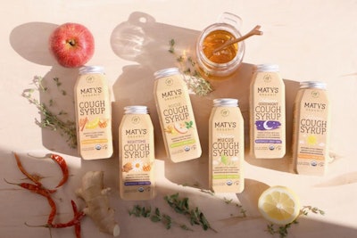
New, 6-oz custom bottles, manufactured by Berlin Packaging from recycled high-density polyethylene, are square with a tapered shoulder and feature a twist-on cap, also from Berlin, that was inspired by metal mason jar lids. Early on, Haberman decided to dispense with the outer carton to help reduce packaging waste. Because of this, says Berg, the bottle needed to have premium real estate. “We also wanted to convey the simplicity and purity of the ingredients,” he adds. “A more decorative bottle would have sent the wrong message. The simple shape was a decision based on function and brand messaging.”
The package also dispenses with a dosing cup, as did the previous package design. While Maty’s offers a suggested dosage, because the products are made from whole food ingredients, it’s safe to take more.
Decorating the bottle is a 2-mil PETG sleeve label process-printed with a matte finish from Consolidated Label. Label graphics are entirely new, including a new logo designed to convey the feeling of “your grandma’s kitchen mixed with the vibe of a modern leader in natural and organic medicine,” Berg says. “The humble, rounded slab serif makes it charming and approachable. The subtle arch and warm feel of the mark conveys a feeling of comfort.”
The strategy for the new label design was “food first,” with illustrations of ingredients such as lemon slices, cinnamon sticks, honey, and apple slices, for example, prominent on the front panel. “By illustrating the ingredients, we convey an all-natural, but also a folk-like, aesthetic,” says Berg. “The look and feel really pops next to the bold reds, blues, and oranges of the traditional medicine aisle shelves.”
The Maty’s All-Natural line of remedies uses a white background and white polypropylene cap, while Maty’s Organic varieties have a Kraft brown-colored label, with a silver aluminum screw-on closure.
The new packaging was introduced on shelves in September 2017.